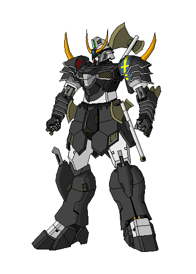
I've been probably working on this on and off for about a year. This picture is probably about 80% complete (left leg still missing detail), working on decaling up the shield, and also fixing the right hand. Would like to show it now to get some opinions.
http://img81.imageshack.us/img81/4192/wdfv4.jpg
Thanks.
White Custom Gundam
Thanks for the quick reply, I have a few close ups of it:
http://img148.imageshack.us/img148/9306/beamforkbu3.jpg
The two things under it's chest vents are what they're supposed to be stored (the lines that get cut off on the picture joins to the above)
http://img148.imageshack.us/img148/9306/beamforkbu3.jpg
The two things under it's chest vents are what they're supposed to be stored (the lines that get cut off on the picture joins to the above)
- CYNICISM AT IT'S BEST
- Posts: 599
- Joined: Sun Oct 22, 2006 6:07 pm
- Location: hotboxing a normal suit
- Contact:
Ok, I will be blunt. There is a whole lot wrong with this picture, and by the time I'm done telling you everything that's wrong, you might just decide to restart. For that I apologize. But I recognize some talent in you, and to just let that go unfocused would be a greater crime than just being frank.
Before I point out the faults, let me say that if you listen to nothing else I have to say, plan out your pics (especially before coloring). The fact that this picture has taken you a whole year to get to this point has caused your picture to become a chimera of random ideas. Plan out your picture, make sure you have a good foundation before you go off inking and coloring.
Now, the meats and potatoes of the critique. I can tell that you eyeballed existing art and tried to figure out how they work, but you've only cribbed enough to get you in trouble. The final outcome is that your perspective is a horrible, horrible mess. I don't think I'll be able to stitch everything together into long, flowing prose, so I'll just list off stuff you need to work on.
-The head and center chest parts show no vanishing point (the point where parallel lines appear to meet in the distance) while everything else seems to be working on two or three different ones.
-You didn't take occlusion (how parts of objects are hidden when something is in front of it) into account when you drew the right side of the chest, and as a result it looks almost twice as big as the left side. Right side is also sitting higher than the left side.
-The head, chest, and lower torso are all working off their own center lines instead of a single one. This makes your picture progressively lopsided.
-The placement of the right shoulder pauldron above the left one seems to show that you were trying to give it a vanishing point (though incorrect), but the lines of pauldrons themselves have no vanishing point.
-The shoulder accoutrements are not centered, and in fact you actually drew the left one in front of the shoulder armor instead of behind it.
-I don't know if you were going for asymmetry with the head or not, but the right and left side details are different. This could be because you drew the head in chunks over the year or you didn't know how to draw it correctly, but there you have it. Also, the V-fin's perspective is different from the rest of the head and thus looks lopsided. Face is also off.
-Same problem with the chest applies to the legs. The right thigh connects higher and further from the hop joint than the left side.
-Left side hip armor and left thigh are on two different perspectives. Hip armor is currently digging into the leg instead of riding on top of it.
-You should use a finer line width for detail such as panel lines and a thicker line width for defining shapes. Right now you have everything at one line width and it makes the picture look busy.
-The shield saber...is a mess. I don't think you really need me to tell you that. Lines are just going all over the place on it.
All these things should have been corrected at the sketch or inking stages. You should learn to work macroscopically and then finish microscopically. Make sure the big details are correct before working on the small ones.
I like it. Looks inspired by Unicorn.
V2buster makes good points but the long and short of it is you need to practice perspective.
When he mentions, you need to plan out your pics....it's sometimes worthwhile to do the basic shape of the entire figure then add on the "extras" if you will. For instance, draw the entire Gundam and THEN draw on the shield and guns. It helps with placement and keeping the perspective.
It also helps to draw the basic details all at once and then draw the micro details. In other words, don't draw the head in full detail then go to the chest, do that in full detail and continue like that....you'll lose the opportunity to correct the basic flaws in your artwork that way. I hope you understand.
Practice some more please. Use simpler shapes if necessary. You'd be surprised how cool some simple shapes put together with good perspective, interesting angle, posing and colour scheme can form an excellent picture.
EDIT: It may help to look at pics of Gundam models. You'll really have a reference for proportions and perspectives that way.