Seraphic's Section - digital art livestreams
-
Seraphic

- Posts: 1434
- Joined: Fri Jun 22, 2007 1:56 am
- Location: Inside the barrel of Wing Zero's left Buster Rifle.
Sorry for the late response. I'm trying to avoid unnecessary bumps. Thank you for your compliments, Daemoro, but I think that if you're trying to fit in around here, you should quietly ignore me like everyone else. =p
Today is my birthday. And I guess I've been around here for a little more than a year. It's been interesting.
My pencil broke. It's the one I've had for two years. My sister gave it to me before I left for college. Everything I've posted here (with the one exception of 'For the Kill') was drawn using that pencil. I'm supposed to get a new one when I visit home again.
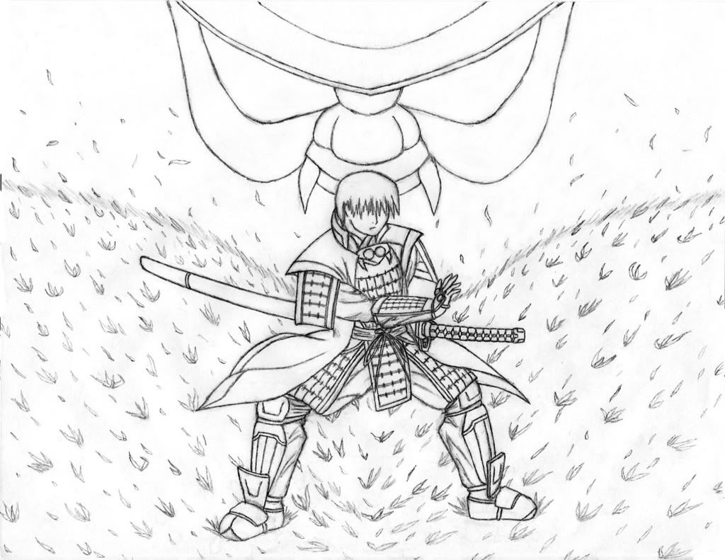
To celebrate, I thought I'd just post a little something to pass the time. The broken pencil still functions technically, so I finished the last parts of this drawing with it. This is Kaze and the demon mask from his helmet. I normally don't do backgrounds, which is why this took so long, and you can see why I try to avoid it. I'm somewhat disappointed, but I was probably biting off more than I could chew when I wanted to do grass. If anyone notices, his armor is slightly modified from the last picture. I hope it looks better now. This is only the lineart for the picture, which is why I haven't "signed" it yet. I'm going to go back and shade it all in, which should take about a month if I know myself right. Hopefully the grass will look better after that. Oh, and this was done on copy paper instead of the usual notebook paper. I'd die before I finished removing the lines from the entire page, otherwise.
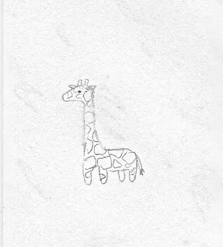
My other sister also drew this giraffe on the back of the paper. I thought it looked nice.
After this drawing, I taped the pencil back together and started on a new drawing, but it's nowhere closed to finished, so it will be a while. I also have some stuff that is ready to post, but I want to wait until I (start and) finish up Chapter 4. I'm pretty excited about those.
Anyhow, that's just a lot of talk over nothing. Thanks for taking a look.
=o
Today is my birthday. And I guess I've been around here for a little more than a year. It's been interesting.
My pencil broke. It's the one I've had for two years. My sister gave it to me before I left for college. Everything I've posted here (with the one exception of 'For the Kill') was drawn using that pencil. I'm supposed to get a new one when I visit home again.
To celebrate, I thought I'd just post a little something to pass the time. The broken pencil still functions technically, so I finished the last parts of this drawing with it. This is Kaze and the demon mask from his helmet. I normally don't do backgrounds, which is why this took so long, and you can see why I try to avoid it. I'm somewhat disappointed, but I was probably biting off more than I could chew when I wanted to do grass. If anyone notices, his armor is slightly modified from the last picture. I hope it looks better now. This is only the lineart for the picture, which is why I haven't "signed" it yet. I'm going to go back and shade it all in, which should take about a month if I know myself right. Hopefully the grass will look better after that. Oh, and this was done on copy paper instead of the usual notebook paper. I'd die before I finished removing the lines from the entire page, otherwise.
My other sister also drew this giraffe on the back of the paper. I thought it looked nice.
After this drawing, I taped the pencil back together and started on a new drawing, but it's nowhere closed to finished, so it will be a while. I also have some stuff that is ready to post, but I want to wait until I (start and) finish up Chapter 4. I'm pretty excited about those.
Anyhow, that's just a lot of talk over nothing. Thanks for taking a look.
=o
"Red particles are bad, they mutate you into... dead? But green/blue particles are good, apparently, for reasons and for purposes yet to be determined. Isn't science sometimes nicely color-coded?"
-Antares
GW: The Sword . Sera's Art . Gameplay . The Lost Citadel
-Antares
GW: The Sword . Sera's Art . Gameplay . The Lost Citadel
-
Draco Starcloud

- Posts: 1114
- Joined: Sun Mar 05, 2006 7:21 pm
- Contact:
That Samurai drawing is pretty cool; is that a Pokemon behind him?
And your sister drew a cute giraffe.
And your sister drew a cute giraffe.
Draco's Lair - Latest Update: 1/9/10Chris wrote:IMMA CHARGIN MAH MAHQ @_@
hey you do alright with your line art. Though i'd like to see your characters with more expression. It's nice and clean which is good. Work on them proportions. Hands and feet are too small and the bodies are awkward in shape and movement. Nice work so far, i want more....MORE!!! *points a gun at you
....why leave this open to insert images! GAHHHH
-
Seraphic
- Posts: 1434
- Joined: Fri Jun 22, 2007 1:56 am
- Location: Inside the barrel of Wing Zero's left Buster Rifle.
Bumped up from page 4. =)
Okay, so I haven't actually quit, and I've been doodling some. The deal is, I actually got a bunch of large projects done that I was supposed to post a long time ago, but they're reserved for Ch. 4 of Red Dawn, and unfortunately, I was never able to write that out and I can't spoil the chapter. And I think you would have really liked them, too. Really sorry, guys. Maybe some time in the Winter. =/
In the mean time, I've been working on some other things, including some of my very first 4koma. My sense of humor is a little weird, but maybe you'll find them funny, also. ....and they happen to be related to my fiction in ways, but humor is supposed to be universal, so hopefully that doesn't turn anyone off. Anyhow....
4koma001 - Jen and the Banana
Now, before you click this link, I want you to read the title and wonder what could possibly be going on here. I think that's the only real way you might get what's the point of it. It's a little subtle. Hands are difficult for me. And no, I couldn't keep a straight face while drawing this.
(The pacing/time between panels is supposed to be rather long, actually. So take your time soaking in the images. Same thing goes for the second 4koma. I'm not sure how to visually create the delay/time....)
4koma002 - Gardening with Heero Yuy
Inspired by a conversation I actually had in real life. SD is harder than it looks. x,x I like the last panel, but I nearly ran out of room for text on it! I'm thinking about replacing my bad "handwriting" with photoshop text eventually....
I hope those were funny. I'd like to do more, but unfortunately I don't have many other ideas at the time. Other than these, I'm working on a portrait of sorts, and I'm thinking about putting another Gundam idea down on paper. Looking forward to some helpful comments. Thanks for taking a look. =)
"Red particles are bad, they mutate you into... dead? But green/blue particles are good, apparently, for reasons and for purposes yet to be determined. Isn't science sometimes nicely color-coded?"
-Antares
GW: The Sword . Sera's Art . Gameplay . The Lost Citadel
-Antares
GW: The Sword . Sera's Art . Gameplay . The Lost Citadel
-
ShadowCell

- Moderator
- Posts: 4716
- Joined: Sun Mar 05, 2006 12:59 pm
- Location: California
- Contact:
Are you sure that wasn't me? I've done similar things to my mother's plants. "Huh, this plant is brown and it's roots aren't even holding it up" *pulls giant shovel out of nowhere* "It's okay little plant, it'll be better this way"Seraphic wrote:4koma002 - Gardening with Heero Yuy
Inspired by a conversation I actually had in real life.
Your art looks good by my ill-informed standards.
Edit: Interesting post for the transition to Elitist Earth Politician
-
crashlegacy14

- Posts: 511
- Joined: Thu Nov 15, 2007 1:38 am
- Location: In the Zaku's cockpit. Yes, the one that just exploded.
- Contact:
gezee how'd I miss this. ah your Gardening with Heero Yuy is a instant classic
Crash's Mecha Design Works
Crash's Mecha Based RPG
-----------------//-----------
ShadowCell wrote: Perspective. It's great.
CrashLegacy14 wrote: my immortal enemy: Perspective.
Crash's Mecha Based RPG
-----------------//-----------
ShadowCell wrote: Perspective. It's great.
CrashLegacy14 wrote: my immortal enemy: Perspective.
-
Seraphic
- Posts: 1434
- Joined: Fri Jun 22, 2007 1:56 am
- Location: Inside the barrel of Wing Zero's left Buster Rifle.
I must be susceptible to flattery. 
Anyway, guys, I'm going to post some random junk for you. Mostly just stuff I haven't added or sketchwork I've done to help other people. (Really, just a distraction while I go work on bigger things...! )
)
The Zulong Gundam from the September Contest. 2nd place, hahaha, and by one vote. >.< I won't add this into the first post archive until it shows up in the story though. I think this will be one of the first things I color once Crash and I get around to collaborating on my art lesson.
Oxtail Saber and Chain Whip Demonstration. I was never too impressed by the Zulong's design--it's just a mass produced Gundam, after all. What I do love about it is the outright performance of the thing. It's thanks to the HYABUSA system, which I will get to introduce soon. Let me show you:
Chain Whip Document. Not like the heat rods of yesteryear! The last half of the video is kinda dumb, though. I don't think the Zulongs will quite be able to approach this level of speed or technique, but it'll still be a very useful offhand weapon for them. Sudden strikes, and very disorienting for enemy units. It'd take a real balls-y pilot to use one as a main weapon or to use dual whips in a MS battle. =/
Sword and Saber Document. Again, you'll notice that these videos are pretty superficial, but they get the point across, generally. I plan on doing many more diagrams for the Zulong, demonstrating other weapons it can use or hand-to-hand styles. That project is a ways off in the future, however. I'll include documentaries along with each diagram if possible.
Onto other things:
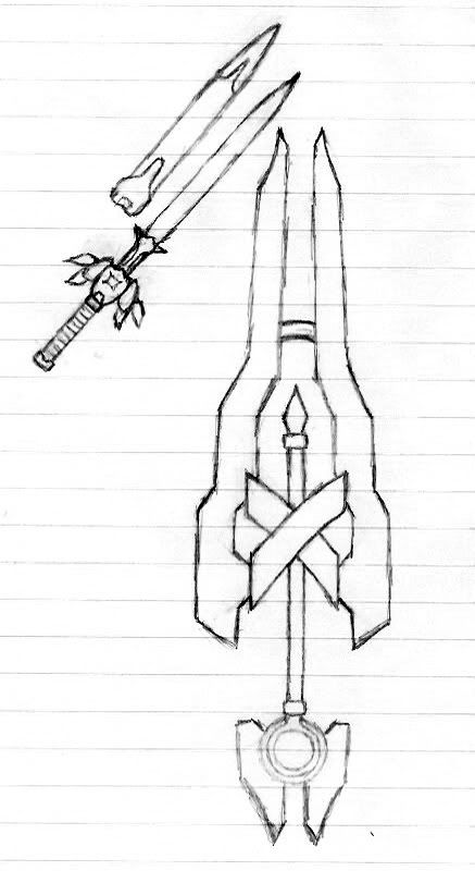
I often help one of my friends work on his story projects. He never gets anything down on paper for whatever reason. This is from his story Pandora Complex. I told him that a complex is a psychological condition, and that if he's to call the story that, he needs to define what the condition is, but I guess he's largely ignored me on that front. The main character is a swordsman, and in one part of the story, one of his partners, a mage/priestess type person, turns to attack him. Her staff is supposed to morph into a sword, and she supposedly defeats the main character. I thought it lame that someone can spontaneously start using a sword and do all that, so, I designed the staff's sword form like this. (It's the larger one.) You can see the original weapon in the center, and the new bladed parts grow around it. I thought it's good for a changing weapon to still retain traits from its original form.
Priestess ladies using swords randomly and WINNING frustrated me, so I gave her a sword that would make the main character very much question his manliness. Overcoming the weirdness of the situation with awesome, hahaha.
The other sword is mostly useful for scale comparison. It's another sword I tried to help him with, but I really don't like its design, looking back at it. =/ It's supposed to be a sword with a simpler appearance, with a ricasso above the crossguard for extra leverage. It's actually a Valkyrie weapon called the Sword of Ingrid, and controls lightning. I'm going to give the sword an appropriate redesign when I can. The weapon belongs to the main character's older brother, and I pretty much drafted the weapon's entire background. Here is its special attack.
Some kind of horribly evil cross between Super Lightning Blade and Sword of the Cosmos, hahaha. (Kratos and Thrud join forces!) What should we name it? Sorry for the quick and ugly sketches. I was just trying to get ideas across.
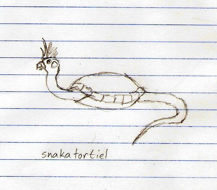
Anyway, amuse yourselves with this chimera. The name makes it kind of obvious, but can anyone guess what three animals it is made of??
Okay, I'm off to update the Library. Then I'll officially be starting Episode 4: The Restless Dogs of War, which will come with more pictures!! Until then! =)
Anyway, guys, I'm going to post some random junk for you. Mostly just stuff I haven't added or sketchwork I've done to help other people. (Really, just a distraction while I go work on bigger things...!
The Zulong Gundam from the September Contest. 2nd place, hahaha, and by one vote. >.< I won't add this into the first post archive until it shows up in the story though. I think this will be one of the first things I color once Crash and I get around to collaborating on my art lesson.
Oxtail Saber and Chain Whip Demonstration. I was never too impressed by the Zulong's design--it's just a mass produced Gundam, after all. What I do love about it is the outright performance of the thing. It's thanks to the HYABUSA system, which I will get to introduce soon. Let me show you:
Chain Whip Document. Not like the heat rods of yesteryear! The last half of the video is kinda dumb, though. I don't think the Zulongs will quite be able to approach this level of speed or technique, but it'll still be a very useful offhand weapon for them. Sudden strikes, and very disorienting for enemy units. It'd take a real balls-y pilot to use one as a main weapon or to use dual whips in a MS battle. =/
Sword and Saber Document. Again, you'll notice that these videos are pretty superficial, but they get the point across, generally. I plan on doing many more diagrams for the Zulong, demonstrating other weapons it can use or hand-to-hand styles. That project is a ways off in the future, however. I'll include documentaries along with each diagram if possible.
Onto other things:
I often help one of my friends work on his story projects. He never gets anything down on paper for whatever reason.
Priestess ladies using swords randomly and WINNING frustrated me, so I gave her a sword that would make the main character very much question his manliness. Overcoming the weirdness of the situation with awesome, hahaha.
The other sword is mostly useful for scale comparison. It's another sword I tried to help him with, but I really don't like its design, looking back at it. =/ It's supposed to be a sword with a simpler appearance, with a ricasso above the crossguard for extra leverage. It's actually a Valkyrie weapon called the Sword of Ingrid, and controls lightning. I'm going to give the sword an appropriate redesign when I can. The weapon belongs to the main character's older brother, and I pretty much drafted the weapon's entire background. Here is its special attack.
Some kind of horribly evil cross between Super Lightning Blade and Sword of the Cosmos, hahaha. (Kratos and Thrud join forces!) What should we name it? Sorry for the quick and ugly sketches. I was just trying to get ideas across.
Anyway, amuse yourselves with this chimera. The name makes it kind of obvious, but can anyone guess what three animals it is made of??
Okay, I'm off to update the Library. Then I'll officially be starting Episode 4: The Restless Dogs of War, which will come with more pictures!! Until then! =)
"Red particles are bad, they mutate you into... dead? But green/blue particles are good, apparently, for reasons and for purposes yet to be determined. Isn't science sometimes nicely color-coded?"
-Antares
GW: The Sword . Sera's Art . Gameplay . The Lost Citadel
-Antares
GW: The Sword . Sera's Art . Gameplay . The Lost Citadel

Some sort of canine, a zebra, and what appears to be a loaf of breadSeraphic wrote:
Anyway, amuse yourselves with this chimera. The name makes it kind of obvious, but can anyone guess what three animals it is made of??
mcred23 wrote: Well... it's official: O'Regan is the next Hitler.
WhiteWingDemon wrote: Not to start anything, seeing as that is O'Regan's job...
ShadowCell wrote: O'Regan, quit hitting on other users.
Orrick Alexander wrote: Did anyone know that O'Regan is the reason there's no air in space?
-
crashlegacy14
- Posts: 511
- Joined: Thu Nov 15, 2007 1:38 am
- Location: In the Zaku's cockpit. Yes, the one that just exploded.
- Contact:
loaf of bread ftw...
Crash's Mecha Design Works
Crash's Mecha Based RPG
-----------------//-----------
ShadowCell wrote: Perspective. It's great.
CrashLegacy14 wrote: my immortal enemy: Perspective.
Crash's Mecha Based RPG
-----------------//-----------
ShadowCell wrote: Perspective. It's great.
CrashLegacy14 wrote: my immortal enemy: Perspective.
-
Seraphic
- Posts: 1434
- Joined: Fri Jun 22, 2007 1:56 am
- Location: Inside the barrel of Wing Zero's left Buster Rifle.
Mods, please pardon this one outburst of mine: FUCK!! YEAH!!! (go forum censor! haha)
Okay, that's out of my system, but I'm still very very excited. I got Episode 4 posted up, The Restless Dogs of War. The chapter was a beast, but it's ready to be enjoyed. If you do plan on reading the story, please read it first instead of looking at the rest of this post, as it will have very terrible spoilers for the chapter. (The chapter is also practically MADE OF "holy shit" moments, so I do recommend reading it.)
Oh, and I got my very first topic Z! Meaning it's a popular topic, per se. =)
*spoilers begin here*
To celebrate the momentous posting of the new chapter and the art that comes with it, I created my first demotivator! This thing is my pride and joy. (Image used to make it.) To be honest, drawing it actually went a lot faster than normal since this is not a design I was drawing for the first time. The problem was, I was drawing it when I was supposed to be studying for a math final last spring. I bombed the exam and flunked the class. But was it worth it?! (Don't follow Seraph's example, boys and girls. He's a terrible influence!)
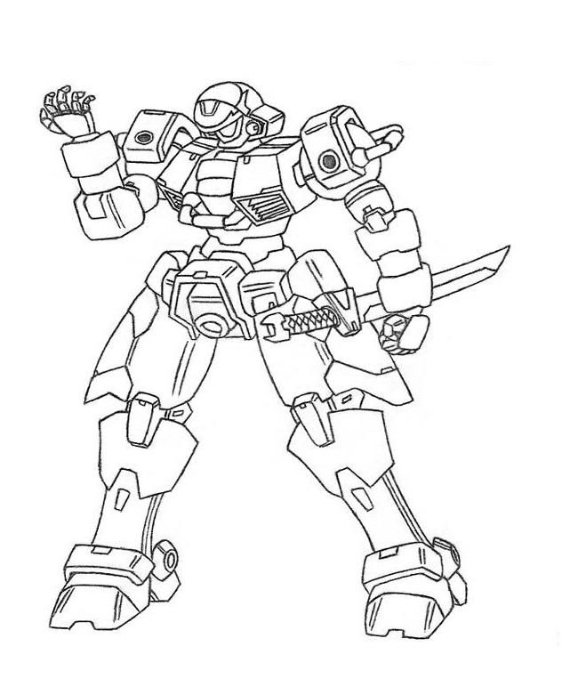
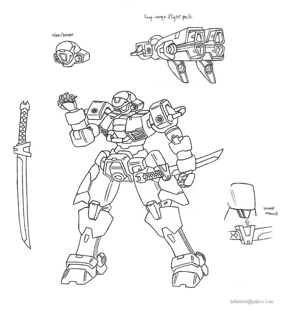
Oh, and I get to start posting profiles! Look:
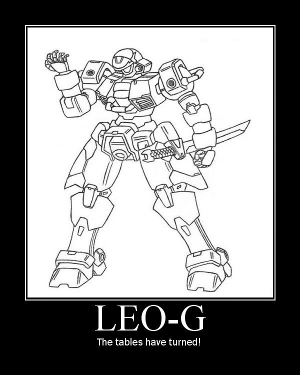
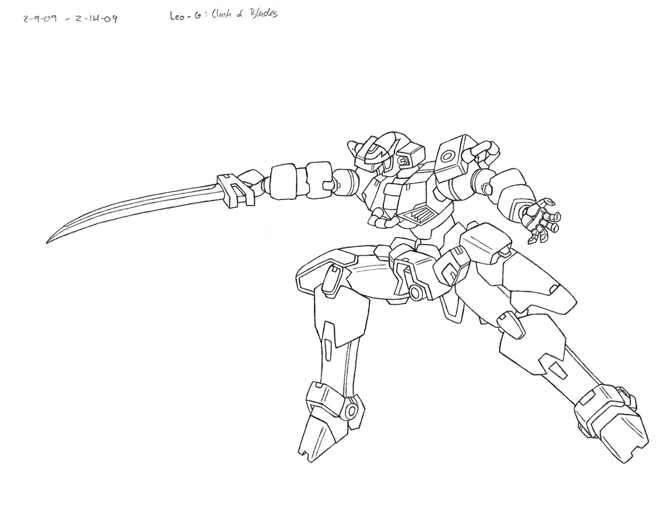
Leo-G, Grand Leo, full diagram, pencil on notebook paper.
Role: Superiority Mobile Suit
Features: 360 Degree Cockpit, HYABUSA
Armaments: Heat Sword x1
Options: Long-range flight pack
Description:
The forerunner of the next generation of mobile suits, the Leo-G is developed by Heero Yuy to have a frame and operating system that work to fight as naturally as a pilot might do in person. Since it was only built for testing purposes, its only armament is a curved, single-edged heat sword that mounts onto the hip when not in use. The Leo-G only sees combat once when defending the Sanc Kingdom from Mars’ messenger of war.
*Tech note:
Heero Yuy Advanced Build: United Strength and Agility, “HYABUSAâ€
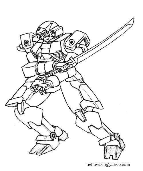
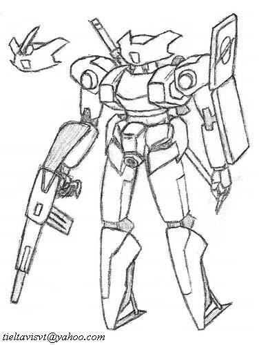
First drawing for comparison.
What I was going for here is simplicity in design, yet extremly high performance. The Leo-G is supposed to be able to out-fence both the Wing Zero and Epyon, maybe even with its regular sword. Yeah, you heard me: this LEO is a freaking beast! The design of the frame itself is somewhat derivitive of another unit, but that was done very purposefully. (You will find out why in Ep. 5, if that ever makes it out.) Personally, I am just in love with the frame. It perfectly exemplefies my design philosophy: high performance basic frames with a very powerful but agile appearance. Its sense of presence on the page is just incredible, which is something I can only create by drawing this thing by hand. I try to add a lot of personality to my designs so that they don't just sit there all boring-like as most profile pictures do. I particularly like the torso and waist. (Note: ...I also forgot to draw the rear skirt parts. Oh well??)
The flight-pack is a fraggin' huge rocket. While designing, I was wavering between a balance of wings for gliding and rocket size for speed. Guess which direction I went?
Your first impression of the sword might be that it is too short, but I think we're all spoiled by our video games and anime shows. This length and proportion is actually perfectly balanced for the Leo-G's build. Just look carefully and you'll know what I mean.
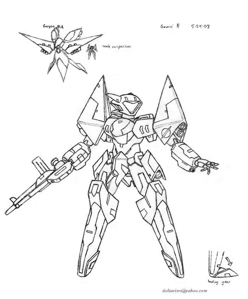
As for the other thing that showed up:
Gemini II
Role: Space Type Mobile Suit
Features: MD Control System
Armaments: Rifle x1, Arm-mounted Beam Saber x2, Shield x2
Options: Beam rifle, Machine gun, Heat Sword
Description:
A manned MSR mobile suit that’s designed for non-ranked pilots. It has an MD control system, and is usually escorted by several Gemini Dolls. It operates well in both space and atmosphere, being relatively fast, but otherwise has nothing special going for it. The first unit sent to Earth is a stripped down version fitted with a mobile doll computer.
Not so lovely, but likeable in ways. I like its shoulders. It's a cannon fodder design, really, but at least it has a lot of personality in the profile picture. Need to work on rifle designs..... My sister (the same one that drew the giraffe) made this modification to the design. Utterly hilarious. -_-;
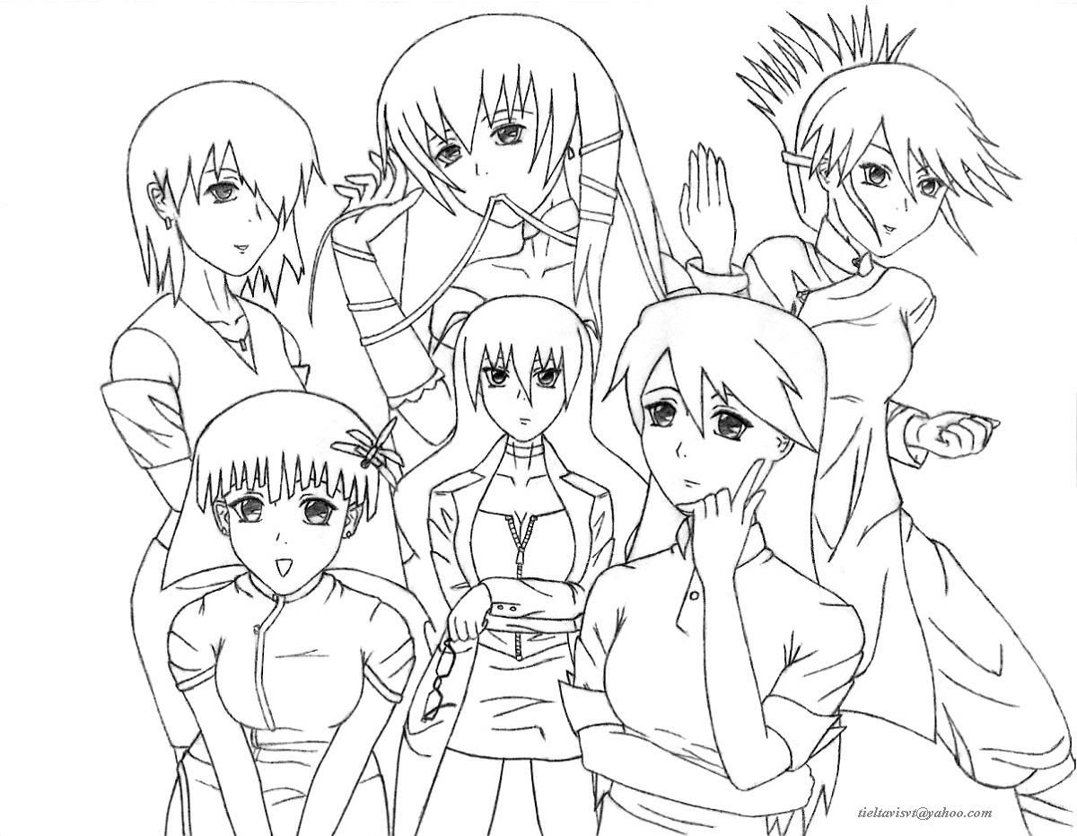
This last drawing I will post and discuss started as a bit of an inside joke with myself (and potentially any readers of ch. 4.) I still find it a bit amusing, but it turned out surprisingly nice, so....
Mackin' the Honeys, pencil on copy paper.
Now, this title is extremely unusual if you know me well enough, but you'll understand why I chose this specific language if you read the story. This drawing is huge. It took up the entire page, and took about 3 or 4 days of DEDICATED drawing. (That ate up time I was supposed to use for writing, which is one explanation for 4's delay.) The reason it actually took so long is that I didn't realize that while I worked on other parts of the page, my hands were rubbing away lines I had already drawn. So really, I think I technically drew this picture five times at least. Art lesson of the day: draw in certain patterns to avoid rubbing. If you're right-handed, start at the top-left, work your way bottom-right. Turn the paper upside-down if you need.
This is the first drawing that majorly emphasized wrinkles in clothing. You can tell I'm going at it with trial and error. -_-;
As for the drawing itself, it's a poitrait of sorts of Jen and *Wufei's five wives. I meant it to be funny and have kind of a harem look to it, but as the drawing progressed, the characters themselves became a lot more interesting than my original intentions as I eventually figured out their personalities. I guess I'll go ahead and discuss each of them, in the order they were drawn.
Bottom-Right: I started with Jen Aoki, obviously, because I already know what she looks like and can draw her easily to start the picture. Her eyes are a bit too large for my intended look for her, but I guess it may be too difficult to fix. Had a lot of trouble with the length of her arms, and stumbled my way with her hands. Yes, I DO often draw by trial and error, which is why everything takes so long. I think she looks good nonetheless, but her expression is a bit hard to describe here. Her personality is hard to pin down also. For this drawing, I'd say the look is something like "she knows more than she's letting on." About her clothes, she is supposed to dress rather casually, but really, it doesn't look interesting. I have to figure out something that is comfortable for her but looks very good on her also. I don't have a lot of know-how with fashion, but I suppose something I could do is go outside to do some "girl watching" or something, but something tells me that I will quickly be apprehended and thrown in jail. You guys have to bail me out!!
Bottom-Left: Mao, or "Bubbles." Needed someone who wasn't a dreary personality. She's pretty amusing in the story, I think. She likes shiny things. Technically, she is probably the most poorly drawn, as this part of the picture is rife with issues. You don't have to tell me. -_-; Wufei married her as a political move between clans. I think I want to try to draw her brother, Fong.
Center: Chi Fong's picture probably amuses me the most of the six. She's an engineer, and is actually wearing a lab coat over that other stuff (but it's sorta hard to tell it's a lab coat.) I like her because she's pretty unusual. She might look mad, but if you can find her eyebrows, she's got more of a "What is it?" inquisitive look to her. I don't go with transparent hair/bangs, sorry. I like her posture and the way she holds her eyeglasses. I'm kinda torn on how to color her hair. Blonde? I don't know. And I guess I could have done something more interesting with her bangs. She's pretty damn cool, haha.
Top-Left: Xia Mei was probably the easiest to draw. I mean it went really fast. It probably has to do with the simplicity of her look, which I like. Random and poorly done sleeves! No, she is not related to Trowa. Nor is she actually Trowa in disguise. (Whoa, I think I just creeped myself out.) She is a renowned musician, and adds a lot of culture to the family.
Top-Center: Lien Hua probably has the coolest name of the bunch, but she gave me the most trouble. I was running out of steam by this point. It has to do with her hair and her expression. I must have redrawn her left eye at least ten times, and her expression is still not right! >.< Anyway, she's not dressed how she is in the story, which is supposed to be business attire. She's the financial backbone of the Dragon Clan. I had intended for her to be the most beautiful, but that probably went to hell. Idea =/= execution. Her ribbon is blue. But I was curious over what blue ribbons were about and I found this:
http://en.wikipedia.org/wiki/Blue_ribbon Pretty nifty.
Top-Right: Lastly, Tao Lin. She will back-hand you. And you will like it. She was probably the most fun to draw, and it re-invigorated me, really. I love her action pose, which was really fun to work with, since she's not just "standing around, lookin' good" haha. She might have the coolest hair amongst them. And I thought her long robe turned out absolutely great. It looks very natural, and the folds flow very well. Any obvious guess why she and Wufei get along?
I know that just from reading this description they'll sound like a bunch of stereotypes, maybe, but I genuinely tried to give each character interesting personalities with important skills as supporting characters that can help them contribute to their place in the story. You'll understand better if you read it, I hope.
Which one of the five do you think Wufei likes the best? Who do you like best or find most interesting? I would very much appreciate comments on this last drawing since I am trying very hard to improve on my character work.
Sorry that I dragged on SOOO much, but I was holding all of this back for months, and many ideas built up. If the drawings drew your interest, please invest some time into reading the chapters. It's awesome. Anyway, thanks for spending ALL DAY here with me. I hope you enjoyed it very much, and please let me know your thoughts, however small or critical. =)
God, I need sleep now. Been awake for more than 24 hrs.... And I don't feel tired anymore, strangely. It's one of those days.
Okay, that's out of my system, but I'm still very very excited. I got Episode 4 posted up, The Restless Dogs of War. The chapter was a beast, but it's ready to be enjoyed. If you do plan on reading the story, please read it first instead of looking at the rest of this post, as it will have very terrible spoilers for the chapter. (The chapter is also practically MADE OF "holy shit" moments, so I do recommend reading it.)
Oh, and I got my very first topic Z! Meaning it's a popular topic, per se. =)
*spoilers begin here*
To celebrate the momentous posting of the new chapter and the art that comes with it, I created my first demotivator! This thing is my pride and joy. (Image used to make it.) To be honest, drawing it actually went a lot faster than normal since this is not a design I was drawing for the first time. The problem was, I was drawing it when I was supposed to be studying for a math final last spring. I bombed the exam and flunked the class. But was it worth it?! (Don't follow Seraph's example, boys and girls. He's a terrible influence!)
Oh, and I get to start posting profiles! Look:
Leo-G, Grand Leo, full diagram, pencil on notebook paper.
Role: Superiority Mobile Suit
Features: 360 Degree Cockpit, HYABUSA
Armaments: Heat Sword x1
Options: Long-range flight pack
Description:
The forerunner of the next generation of mobile suits, the Leo-G is developed by Heero Yuy to have a frame and operating system that work to fight as naturally as a pilot might do in person. Since it was only built for testing purposes, its only armament is a curved, single-edged heat sword that mounts onto the hip when not in use. The Leo-G only sees combat once when defending the Sanc Kingdom from Mars’ messenger of war.
*Tech note:
Heero Yuy Advanced Build: United Strength and Agility, “HYABUSAâ€
First drawing for comparison.
What I was going for here is simplicity in design, yet extremly high performance. The Leo-G is supposed to be able to out-fence both the Wing Zero and Epyon, maybe even with its regular sword. Yeah, you heard me: this LEO is a freaking beast! The design of the frame itself is somewhat derivitive of another unit, but that was done very purposefully. (You will find out why in Ep. 5, if that ever makes it out.) Personally, I am just in love with the frame. It perfectly exemplefies my design philosophy: high performance basic frames with a very powerful but agile appearance. Its sense of presence on the page is just incredible, which is something I can only create by drawing this thing by hand. I try to add a lot of personality to my designs so that they don't just sit there all boring-like as most profile pictures do. I particularly like the torso and waist. (Note: ...I also forgot to draw the rear skirt parts. Oh well??)
The flight-pack is a fraggin' huge rocket. While designing, I was wavering between a balance of wings for gliding and rocket size for speed. Guess which direction I went?
Your first impression of the sword might be that it is too short, but I think we're all spoiled by our video games and anime shows. This length and proportion is actually perfectly balanced for the Leo-G's build. Just look carefully and you'll know what I mean.
As for the other thing that showed up:
Gemini II
Role: Space Type Mobile Suit
Features: MD Control System
Armaments: Rifle x1, Arm-mounted Beam Saber x2, Shield x2
Options: Beam rifle, Machine gun, Heat Sword
Description:
A manned MSR mobile suit that’s designed for non-ranked pilots. It has an MD control system, and is usually escorted by several Gemini Dolls. It operates well in both space and atmosphere, being relatively fast, but otherwise has nothing special going for it. The first unit sent to Earth is a stripped down version fitted with a mobile doll computer.
Not so lovely, but likeable in ways. I like its shoulders. It's a cannon fodder design, really, but at least it has a lot of personality in the profile picture. Need to work on rifle designs..... My sister (the same one that drew the giraffe) made this modification to the design. Utterly hilarious. -_-;
This last drawing I will post and discuss started as a bit of an inside joke with myself (and potentially any readers of ch. 4.) I still find it a bit amusing, but it turned out surprisingly nice, so....
Mackin' the Honeys, pencil on copy paper.
Now, this title is extremely unusual if you know me well enough, but you'll understand why I chose this specific language if you read the story. This drawing is huge. It took up the entire page, and took about 3 or 4 days of DEDICATED drawing. (That ate up time I was supposed to use for writing, which is one explanation for 4's delay.) The reason it actually took so long is that I didn't realize that while I worked on other parts of the page, my hands were rubbing away lines I had already drawn. So really, I think I technically drew this picture five times at least. Art lesson of the day: draw in certain patterns to avoid rubbing. If you're right-handed, start at the top-left, work your way bottom-right. Turn the paper upside-down if you need.
This is the first drawing that majorly emphasized wrinkles in clothing. You can tell I'm going at it with trial and error. -_-;
As for the drawing itself, it's a poitrait of sorts of Jen and *Wufei's five wives. I meant it to be funny and have kind of a harem look to it, but as the drawing progressed, the characters themselves became a lot more interesting than my original intentions as I eventually figured out their personalities. I guess I'll go ahead and discuss each of them, in the order they were drawn.
Bottom-Right: I started with Jen Aoki, obviously, because I already know what she looks like and can draw her easily to start the picture. Her eyes are a bit too large for my intended look for her, but I guess it may be too difficult to fix. Had a lot of trouble with the length of her arms, and stumbled my way with her hands. Yes, I DO often draw by trial and error, which is why everything takes so long. I think she looks good nonetheless, but her expression is a bit hard to describe here. Her personality is hard to pin down also. For this drawing, I'd say the look is something like "she knows more than she's letting on." About her clothes, she is supposed to dress rather casually, but really, it doesn't look interesting. I have to figure out something that is comfortable for her but looks very good on her also. I don't have a lot of know-how with fashion, but I suppose something I could do is go outside to do some "girl watching" or something, but something tells me that I will quickly be apprehended and thrown in jail. You guys have to bail me out!!
Bottom-Left: Mao, or "Bubbles." Needed someone who wasn't a dreary personality. She's pretty amusing in the story, I think. She likes shiny things. Technically, she is probably the most poorly drawn, as this part of the picture is rife with issues. You don't have to tell me. -_-; Wufei married her as a political move between clans. I think I want to try to draw her brother, Fong.
Center: Chi Fong's picture probably amuses me the most of the six. She's an engineer, and is actually wearing a lab coat over that other stuff (but it's sorta hard to tell it's a lab coat.) I like her because she's pretty unusual. She might look mad, but if you can find her eyebrows, she's got more of a "What is it?" inquisitive look to her. I don't go with transparent hair/bangs, sorry. I like her posture and the way she holds her eyeglasses. I'm kinda torn on how to color her hair. Blonde? I don't know. And I guess I could have done something more interesting with her bangs. She's pretty damn cool, haha.
Top-Left: Xia Mei was probably the easiest to draw. I mean it went really fast. It probably has to do with the simplicity of her look, which I like. Random and poorly done sleeves! No, she is not related to Trowa. Nor is she actually Trowa in disguise. (Whoa, I think I just creeped myself out.) She is a renowned musician, and adds a lot of culture to the family.
Top-Center: Lien Hua probably has the coolest name of the bunch, but she gave me the most trouble. I was running out of steam by this point. It has to do with her hair and her expression. I must have redrawn her left eye at least ten times, and her expression is still not right! >.< Anyway, she's not dressed how she is in the story, which is supposed to be business attire. She's the financial backbone of the Dragon Clan. I had intended for her to be the most beautiful, but that probably went to hell. Idea =/= execution. Her ribbon is blue. But I was curious over what blue ribbons were about and I found this:
http://en.wikipedia.org/wiki/Blue_ribbon Pretty nifty.
Top-Right: Lastly, Tao Lin. She will back-hand you. And you will like it. She was probably the most fun to draw, and it re-invigorated me, really. I love her action pose, which was really fun to work with, since she's not just "standing around, lookin' good" haha. She might have the coolest hair amongst them. And I thought her long robe turned out absolutely great. It looks very natural, and the folds flow very well. Any obvious guess why she and Wufei get along?
I know that just from reading this description they'll sound like a bunch of stereotypes, maybe, but I genuinely tried to give each character interesting personalities with important skills as supporting characters that can help them contribute to their place in the story. You'll understand better if you read it, I hope.
Which one of the five do you think Wufei likes the best? Who do you like best or find most interesting? I would very much appreciate comments on this last drawing since I am trying very hard to improve on my character work.
Sorry that I dragged on SOOO much, but I was holding all of this back for months, and many ideas built up. If the drawings drew your interest, please invest some time into reading the chapters. It's awesome. Anyway, thanks for spending ALL DAY here with me. I hope you enjoyed it very much, and please let me know your thoughts, however small or critical. =)
God, I need sleep now. Been awake for more than 24 hrs.... And I don't feel tired anymore, strangely. It's one of those days.
"Red particles are bad, they mutate you into... dead? But green/blue particles are good, apparently, for reasons and for purposes yet to be determined. Isn't science sometimes nicely color-coded?"
-Antares
GW: The Sword . Sera's Art . Gameplay . The Lost Citadel
-Antares
GW: The Sword . Sera's Art . Gameplay . The Lost Citadel

-
Seraphic
- Posts: 1434
- Joined: Fri Jun 22, 2007 1:56 am
- Location: Inside the barrel of Wing Zero's left Buster Rifle.
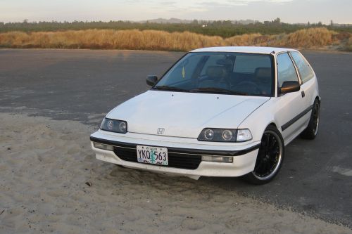
Hey, don't talk shit about Leos, sir. They're actually my favorite grunt units! And I think they're supposed to be GMs, not Zakus, with relatively good performance to boot.
I really like the Leo-G though. What Heero has basically done is take a used Honda Civic and tuned it until he got a Blackbird out of it. =)
The drawings are supposed to be current with the chapter, and Meilan had long passed away before then, so I couldn't include her. And I would obviously be very depressed by her presence in the picture, too. I wouldn't dare try to draw her then, since the page would be soaked with (manly) tears from remembering her and Wufei's story. I think I would like to try a black and white poitrait of her, though. You know, like the ones that Wufei would place on the altar. That might be cool to do.
And as a sidenote:
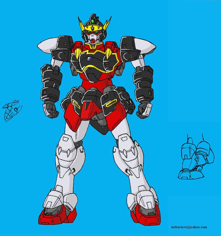
Would this have helped or hurt my chances back in the September contest?
No lineart version.
Original lineart for comparison.
So this is my very first coloring attempt after learning how to lift my lines. The Zulong turned out surprisingly nice. It must have taken an entire day of dedicated work to do this, and I was up 'til about 4:30 in the morning. I really like its dark armor, and then the sheen on top of it. It looks unusually cool without the lineart on top of it, too. I hear that I can eventually get to a point where I won't even need the lines at all, but I don't think I will ever get that good. Honestly, I think this is as far as I want to take my photoshop/coloring skills for now, until I get better through study or experience. This is enough to accomplish what I need, but of course it's always useful to make progress on top of that.
Thanks to everyone who has taken a look or commented. I'm very much looking forward to some more helpful reviews and critiques, which seem to come very rarely around here. I suspect the reason for that is I must be at a level of skill where my work isn't striking enough to impress someone who is only taking a glance, and doesn't take the time to appreciate the work. And I'm also not so terrible that someone of higher skill feels the need to step in and provide help, and anything that could be pointed out is either a little nitpick or an advance skill that I would be too much trouble to type up. So basically, I'm sitting in this little oblivion middle space where no one pays attention. =p Where to go from here?
I really like the Leo-G though. What Heero has basically done is take a used Honda Civic and tuned it until he got a Blackbird out of it. =)
The drawings are supposed to be current with the chapter, and Meilan had long passed away before then, so I couldn't include her. And I would obviously be very depressed by her presence in the picture, too. I wouldn't dare try to draw her then, since the page would be soaked with (manly) tears from remembering her and Wufei's story. I think I would like to try a black and white poitrait of her, though. You know, like the ones that Wufei would place on the altar. That might be cool to do.
And as a sidenote:
Would this have helped or hurt my chances back in the September contest?
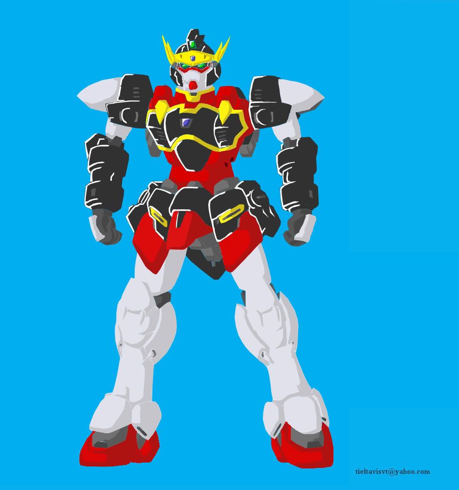
No lineart version.
Original lineart for comparison.
So this is my very first coloring attempt after learning how to lift my lines. The Zulong turned out surprisingly nice. It must have taken an entire day of dedicated work to do this, and I was up 'til about 4:30 in the morning. I really like its dark armor, and then the sheen on top of it. It looks unusually cool without the lineart on top of it, too. I hear that I can eventually get to a point where I won't even need the lines at all, but I don't think I will ever get that good. Honestly, I think this is as far as I want to take my photoshop/coloring skills for now, until I get better through study or experience. This is enough to accomplish what I need, but of course it's always useful to make progress on top of that.
Thanks to everyone who has taken a look or commented. I'm very much looking forward to some more helpful reviews and critiques, which seem to come very rarely around here. I suspect the reason for that is I must be at a level of skill where my work isn't striking enough to impress someone who is only taking a glance, and doesn't take the time to appreciate the work. And I'm also not so terrible that someone of higher skill feels the need to step in and provide help, and anything that could be pointed out is either a little nitpick or an advance skill that I would be too much trouble to type up. So basically, I'm sitting in this little oblivion middle space where no one pays attention. =p Where to go from here?
"Red particles are bad, they mutate you into... dead? But green/blue particles are good, apparently, for reasons and for purposes yet to be determined. Isn't science sometimes nicely color-coded?"
-Antares
GW: The Sword . Sera's Art . Gameplay . The Lost Citadel
-Antares
GW: The Sword . Sera's Art . Gameplay . The Lost Citadel

let me try, hope this helps
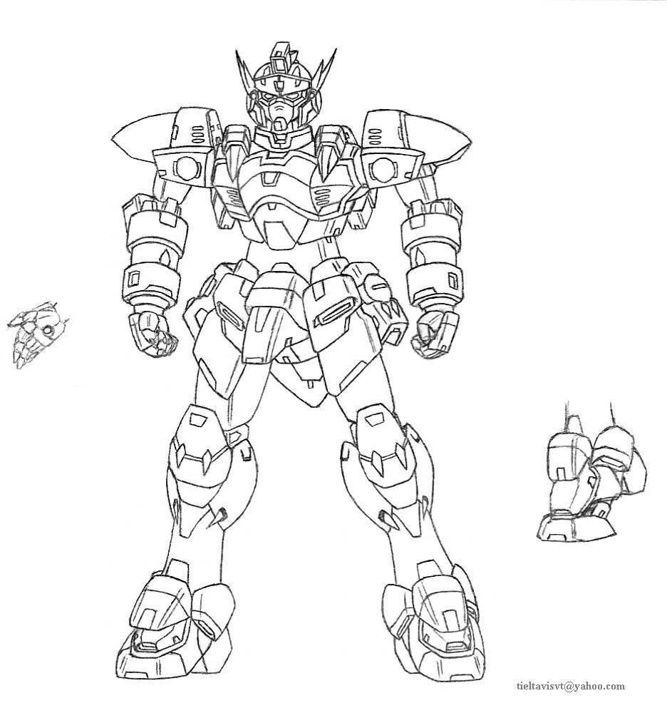
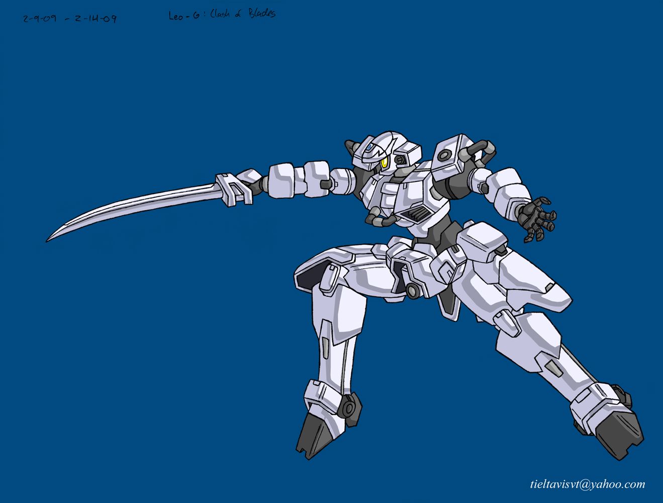
Grand Leo doesn't look like something Heero would use. It looks more like something Graham Aker would.
Those colours look really clean. If you have a tablet and still want to perfect those Photoshop skills, I'd say you might want to start playing with airbrushes for some more interesting effects and shading.
You might also want to start looking into integrating secondary light sources and more contrast in the colours. I'd assume you know what the former is, but if not, it's basically the effect in which colour from external sources is absorbed into the object. It can work, even if you're only aiming for the celshaded look.
Lastly, I'm noticing that you do vary the lines in the lineart version. You might want to make that a bit stronger, and begin tapering some of the sharp ends.
-noel
-
Seraphic
- Posts: 1434
- Joined: Fri Jun 22, 2007 1:56 am
- Location: Inside the barrel of Wing Zero's left Buster Rifle.
Of course it's clean. Who the hell do you think I am?? [/kamina]
Thank you for your pointers, VR. I very much appreciate the input. Man, a lot of people complain about my designs not looking this way or that way. =p It's a Leo for christsake. And then there's my flight variant on the Serpent, which needed an overhaul on the fuselage to be able to move the way I wanted it to.... =p Oh well. You will come to understand the purpose of all of these things as the story progresses.
I actually thought about using secondary light sources (not that I knew that exact term for it >,< ) but I got a little tired and left it as it was. 4:30am, right? It's really just the basic coloring with a single level of shading/highlights. I didn't mean to make a masterpiece out of this one, but I'll definitely try harder when it comes to more important units like my Wing Gundam. (Which I'm going to redo....) Those are actually my original pencil lines, so the tapering is a bit hard to do with a pencil, but I think I should at least do the tapering while working with it in Shop.
Still no tablet. It might be a year or so before I might even be able to afford a decent one. -_-
Anyhow, onto business.
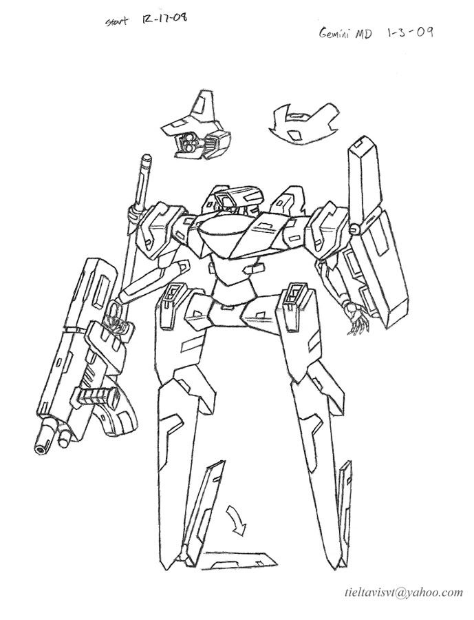
I redid my Gemini mobile doll again, since I wasn't so pleased with it. Here are all three attempts for comparison:
Attempt 1
Attempt 2
Attempt 3 (New.) Pencil on notebook paper, line removal and cleanup in shop.
The first try was generally bad, but I really liked the head, which is why it shows up in the third diagram as an optional commander's piece. The second one is pretty okay, and it has a good vibe to it, but it felt too standard, and didn't look as fast or as weird as I wanted. I think the third try definitely takes the cake, though. Its general figure should be familiar to those playing For Answer, but its literal geometry is still based on the second attempt.
I really like its head. It's hilarious. (The four camera eyed commander option is interesting, too.) The overall frame lost a lot of weight and armor, but it should be so much faster. I thickened the shield, and I put the heat saber on the other shoulder instead of on the back to give it a better sense of symmetry. I tried pretty hard to make that machinegun look good compared to my earlier tries. I purposely made it too heavy for the unit's tiny arms, so it has to fire with both hands. Otherwise, the recoil is too much and the precision is thrown off like crazy. I also like the landing fins. It should balance really well, kinda like how you balance on roller blades. So in this edition, the unit should be fast as hell, but also have pretty good fire power with that heavy machinegun. It's gonna be a tough opponent, especially in numbers.
Growing a bit weary of mechanical design, so I wanted to branch out a little.
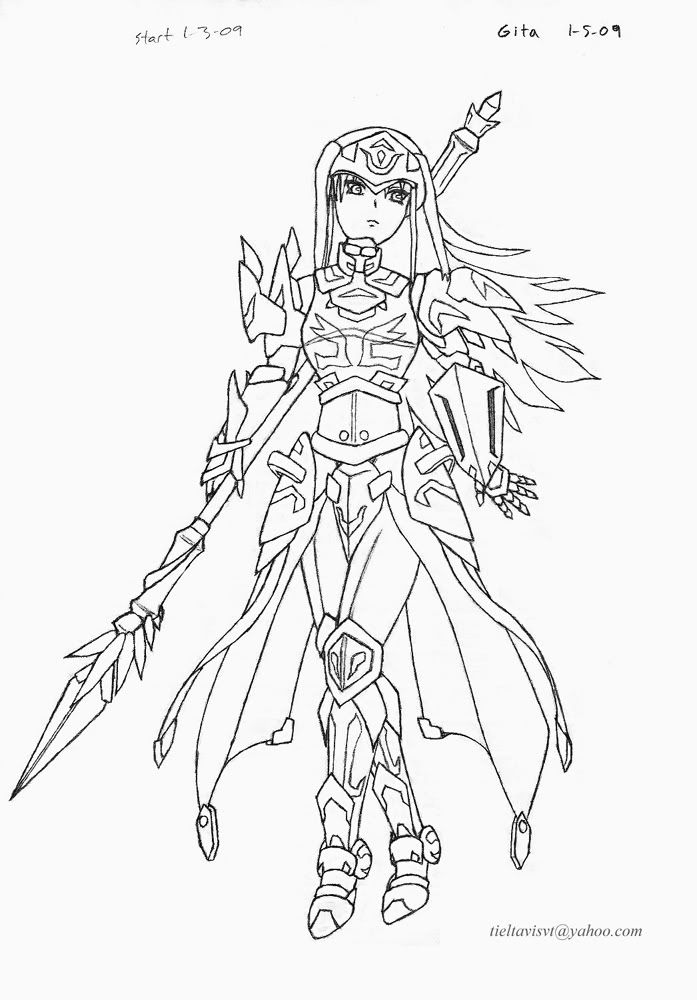
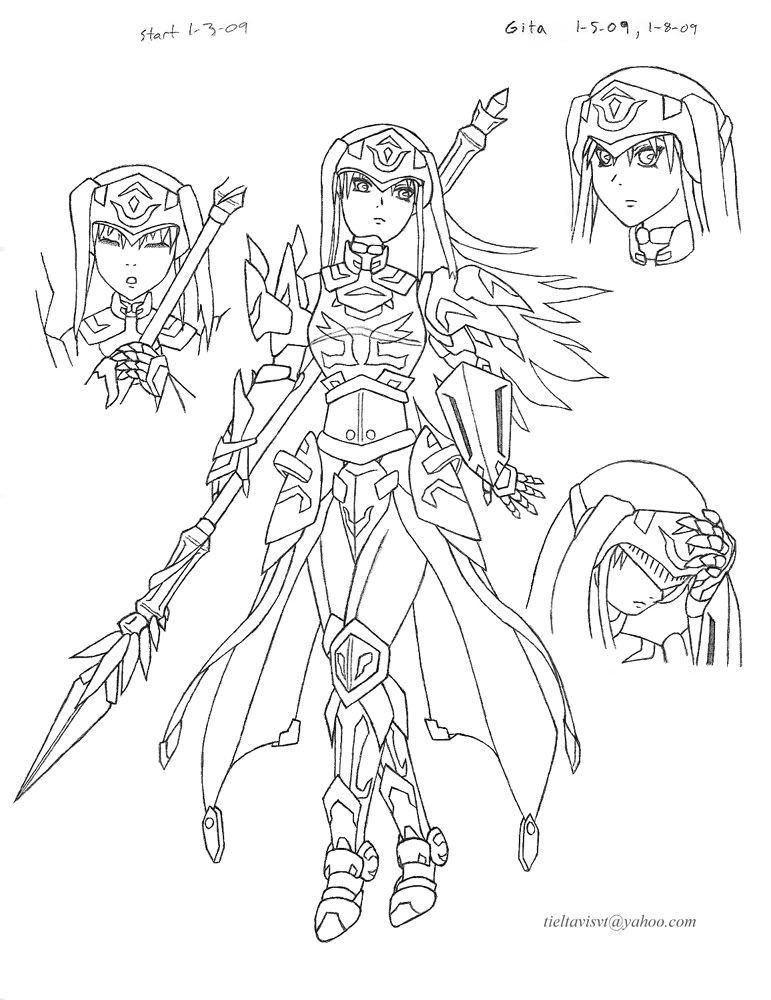
Gita. (First try.) Pencil on notebook paper, notebook lines removed and cleaned up (heavily) in shop.
Edit: here is the complete drawing. Better?
Not that women in armor is so removed from mechs, huh? This is the first drawing where I used my new 3mm pencil officially. It helps a lot in delicate parts like hands and eyes very much. It also darkens lines like no tomorrow, and the precise eraser is very helpful. I'm still getting used to its small grip though. I drew out her figure first, which was a very smart move, and then started adding everything on top of that. I swear her proportions should all be right, but things start to look off because the armor is in the way, especially the skirt pieces. (Her waist is higher than it appears.)
I guess you could say I'm a very conservative designer. I like for things to be both attractive and functional when possible. (What the hell is with those steel bikinis everywhere? Jesus. *shakes head.) The only places where Gita is exposed is her face and the fingers of her right hand. I couldn't figure which shoulder piece I wanted, so I just left it asymmetrical. Her left shoulder is a bit more traditional, but the right shoulder is a little more interesting. (It's actually a borrowed design from something else of mine that I haven't posted yet.) I wonder if she would look better if I just went for symmetry instead? I really like her skirt-cape-thing. I would have went for a regular cape, but it would get in the way of her spear too much. Besides, this looks a lot better. I was also going to give her one of those little micro-cape things for her back, but it quickly became unnecessary for the design. Her arm-shield is also very small to give her left arm more freedom of movement.
Overall, I'd say that I'm okay with the drawing. She didn't turn out as elegant as I wanted. I can't really blame myself on that, since it's my first try. She looks a bit too complex, which is probably something that carried over from my mechanical work..... She also looked pretty damned good before I added those engravings to the armor. Maybe I'll post a clean version without those in the future. I also wanted to do some close-ups for her on the page, but I was too eager over the main part being done that I forgot and scanned it anyway. Guh, and I'll have to RE-CLEAN it after I scan it again. +_+
Gita is from one of these other ideas rollin' around in my head called "As Was Written". Her name means "song" in sanskrit. She's a paladin/songstress/princess. A girl of many talents, haha. =) I think I'll want to try the other characters, too.
Oh, and spears are awesome.
Anyhow, I think that'll be all for today. Sorry for writing so much, but I guess I just have that much to say? And I know I've pretty much analyzed everything for you already, but I would still love to hear your thoughts on my work, especially Gita, since my character stuff doesn't get much attention. Don't let that scare you off! >,< Here's hoping for a productive year for all of us. Cheers, everyone.
*Edit: resized the images to a more reasonable size.
---
Edit 1.9.09
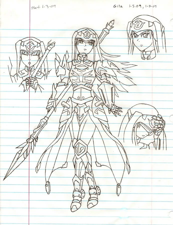
Okay, so I got the full image for Gita. Took long enough. I actually forgot ONE MORE THING, but for the love of god, I'm not going to rescan this thing a third time. I'll just add it digitally if I decide to color this....
If anyone is curious, this is how my images look like raw before they're cleaned up in Shop. I've started using the pen tool as my main cleanup tool now, asides from the eraser tool, even though the eraser is more practical in some cases. It's just that the pen can be hyper-precise, which is what I needed. =) What I basically did was fill in ALL of the negative space MANUALLY using the pen tool, but it left my lines looking pretty good. Only afterward did I do a really small darkening. Eh, I know that sounds impractical, and it probably is, but hey, I think it looks nice at least.
If that water mark on the paper caught your eye, it's because I sneezed, alright?? The paper also grayed easily and deformed really badly in humid air. I'm thinking the next thing I should do is invest in really good quality paper or something. But not a sketchbook, because there's something about a sketchbook that bothers me. I don't really think of myself as an artist, so I draw on paper. Artists draw in sketchbooks. It's really strange reasoning, I know....
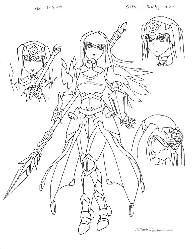
Oh, and here is how Gita's armor looks like without the engravings. Of course, the markings I was able to come up with look really like the work of an amateur. I think the form of the armor is easier to appreciate without them.
I also don't like how her hair works with her helm. I'll have to rethink that in a later attempt.
Blaaaah. Now I'm free to do some tweaks on FA. =o
Thank you for your pointers, VR. I very much appreciate the input. Man, a lot of people complain about my designs not looking this way or that way. =p It's a Leo for christsake. And then there's my flight variant on the Serpent, which needed an overhaul on the fuselage to be able to move the way I wanted it to.... =p Oh well. You will come to understand the purpose of all of these things as the story progresses.
I actually thought about using secondary light sources (not that I knew that exact term for it >,< ) but I got a little tired and left it as it was. 4:30am, right? It's really just the basic coloring with a single level of shading/highlights. I didn't mean to make a masterpiece out of this one, but I'll definitely try harder when it comes to more important units like my Wing Gundam. (Which I'm going to redo....) Those are actually my original pencil lines, so the tapering is a bit hard to do with a pencil, but I think I should at least do the tapering while working with it in Shop.
Still no tablet. It might be a year or so before I might even be able to afford a decent one. -_-
Anyhow, onto business.
I redid my Gemini mobile doll again, since I wasn't so pleased with it. Here are all three attempts for comparison:
Attempt 1
Attempt 2
Attempt 3 (New.) Pencil on notebook paper, line removal and cleanup in shop.
The first try was generally bad, but I really liked the head, which is why it shows up in the third diagram as an optional commander's piece. The second one is pretty okay, and it has a good vibe to it, but it felt too standard, and didn't look as fast or as weird as I wanted. I think the third try definitely takes the cake, though. Its general figure should be familiar to those playing For Answer, but its literal geometry is still based on the second attempt.
I really like its head. It's hilarious. (The four camera eyed commander option is interesting, too.) The overall frame lost a lot of weight and armor, but it should be so much faster. I thickened the shield, and I put the heat saber on the other shoulder instead of on the back to give it a better sense of symmetry. I tried pretty hard to make that machinegun look good compared to my earlier tries. I purposely made it too heavy for the unit's tiny arms, so it has to fire with both hands. Otherwise, the recoil is too much and the precision is thrown off like crazy. I also like the landing fins. It should balance really well, kinda like how you balance on roller blades. So in this edition, the unit should be fast as hell, but also have pretty good fire power with that heavy machinegun. It's gonna be a tough opponent, especially in numbers.
Growing a bit weary of mechanical design, so I wanted to branch out a little.
Gita. (First try.) Pencil on notebook paper, notebook lines removed and cleaned up (heavily) in shop.
Edit: here is the complete drawing. Better?
Not that women in armor is so removed from mechs, huh?
I guess you could say I'm a very conservative designer. I like for things to be both attractive and functional when possible. (What the hell is with those steel bikinis everywhere? Jesus. *shakes head.) The only places where Gita is exposed is her face and the fingers of her right hand. I couldn't figure which shoulder piece I wanted, so I just left it asymmetrical.
Overall, I'd say that I'm okay with the drawing. She didn't turn out as elegant as I wanted. I can't really blame myself on that, since it's my first try. She looks a bit too complex, which is probably something that carried over from my mechanical work..... She also looked pretty damned good before I added those engravings to the armor. Maybe I'll post a clean version without those in the future. I also wanted to do some close-ups for her on the page, but I was too eager over the main part being done that I forgot and scanned it anyway. Guh, and I'll have to RE-CLEAN it after I scan it again. +_+
Gita is from one of these other ideas rollin' around in my head called "As Was Written". Her name means "song" in sanskrit. She's a paladin/songstress/princess. A girl of many talents, haha. =) I think I'll want to try the other characters, too.
Oh, and spears are awesome.
Anyhow, I think that'll be all for today. Sorry for writing so much, but I guess I just have that much to say? And I know I've pretty much analyzed everything for you already, but I would still love to hear your thoughts on my work, especially Gita, since my character stuff doesn't get much attention. Don't let that scare you off! >,< Here's hoping for a productive year for all of us. Cheers, everyone.
*Edit: resized the images to a more reasonable size.
---
Edit 1.9.09
Okay, so I got the full image for Gita. Took long enough. I actually forgot ONE MORE THING, but for the love of god, I'm not going to rescan this thing a third time. I'll just add it digitally if I decide to color this....
If anyone is curious, this is how my images look like raw before they're cleaned up in Shop. I've started using the pen tool as my main cleanup tool now, asides from the eraser tool, even though the eraser is more practical in some cases. It's just that the pen can be hyper-precise, which is what I needed. =) What I basically did was fill in ALL of the negative space MANUALLY using the pen tool, but it left my lines looking pretty good. Only afterward did I do a really small darkening. Eh, I know that sounds impractical, and it probably is, but hey, I think it looks nice at least.
If that water mark on the paper caught your eye, it's because I sneezed, alright??
Oh, and here is how Gita's armor looks like without the engravings. Of course, the markings I was able to come up with look really like the work of an amateur. I think the form of the armor is easier to appreciate without them.
I also don't like how her hair works with her helm. I'll have to rethink that in a later attempt.
Blaaaah. Now I'm free to do some tweaks on FA. =o
"Red particles are bad, they mutate you into... dead? But green/blue particles are good, apparently, for reasons and for purposes yet to be determined. Isn't science sometimes nicely color-coded?"
-Antares
GW: The Sword . Sera's Art . Gameplay . The Lost Citadel
-Antares
GW: The Sword . Sera's Art . Gameplay . The Lost Citadel
-
Seraphic
- Posts: 1434
- Joined: Fri Jun 22, 2007 1:56 am
- Location: Inside the barrel of Wing Zero's left Buster Rifle.
!!ORegan wrote:Some sort of canine, a zebra, and what appears to be a loaf of breadSeraphic wrote:Anyway, amuse yourselves with this chimera. The name makes it kind of obvious, but can anyone guess what three animals it is made of??
You know, I just thought it was the weirdest thing that I happened to find this. Are you some kind of psychic, ORegan, sir?
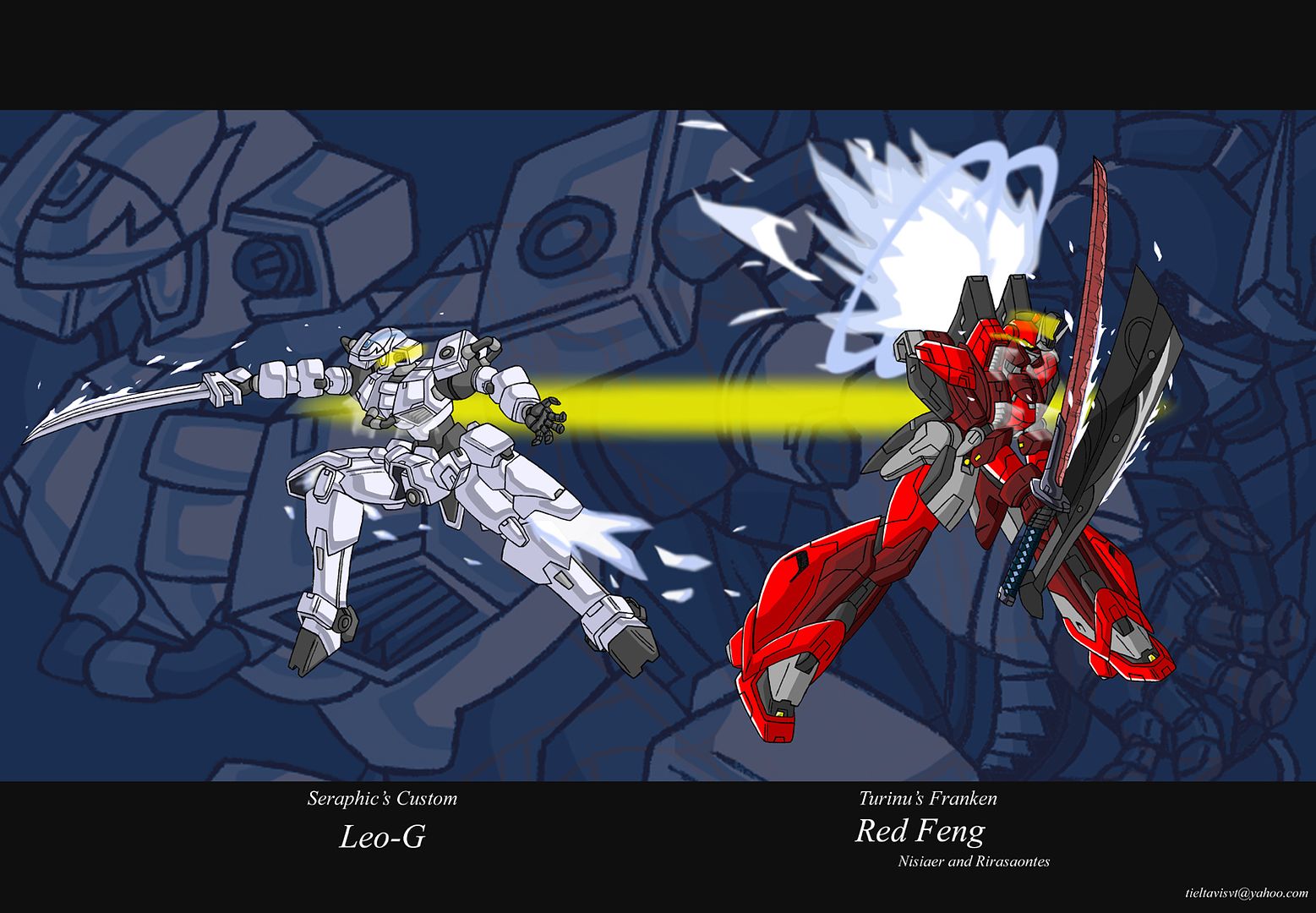
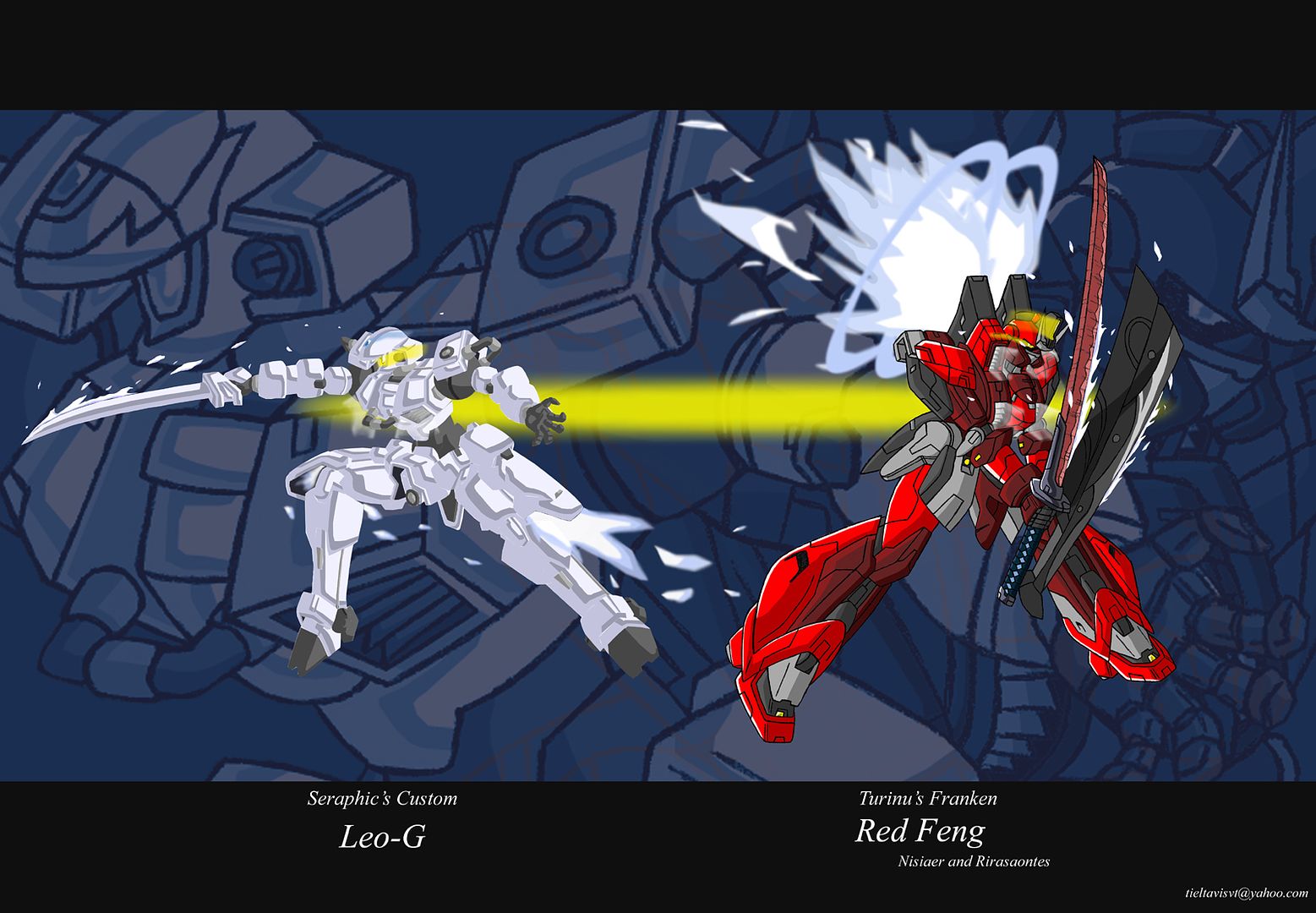
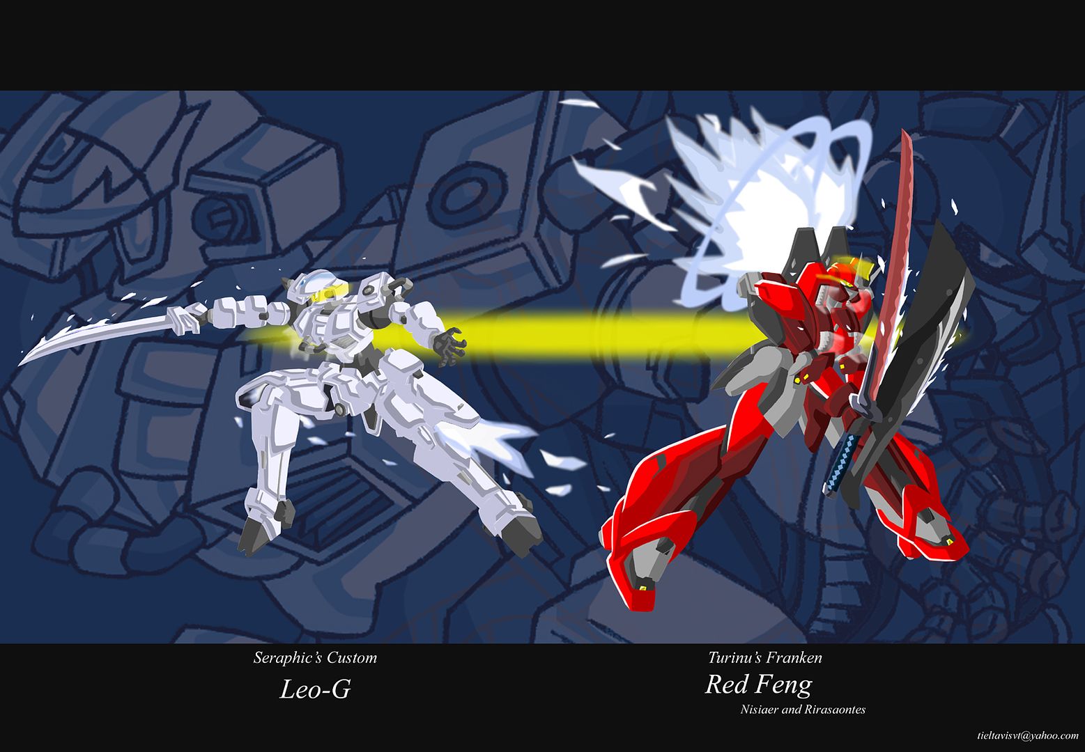
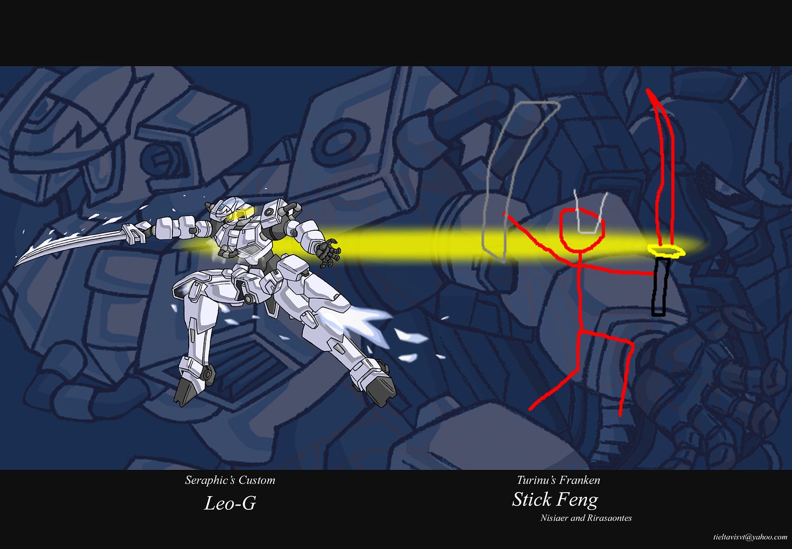
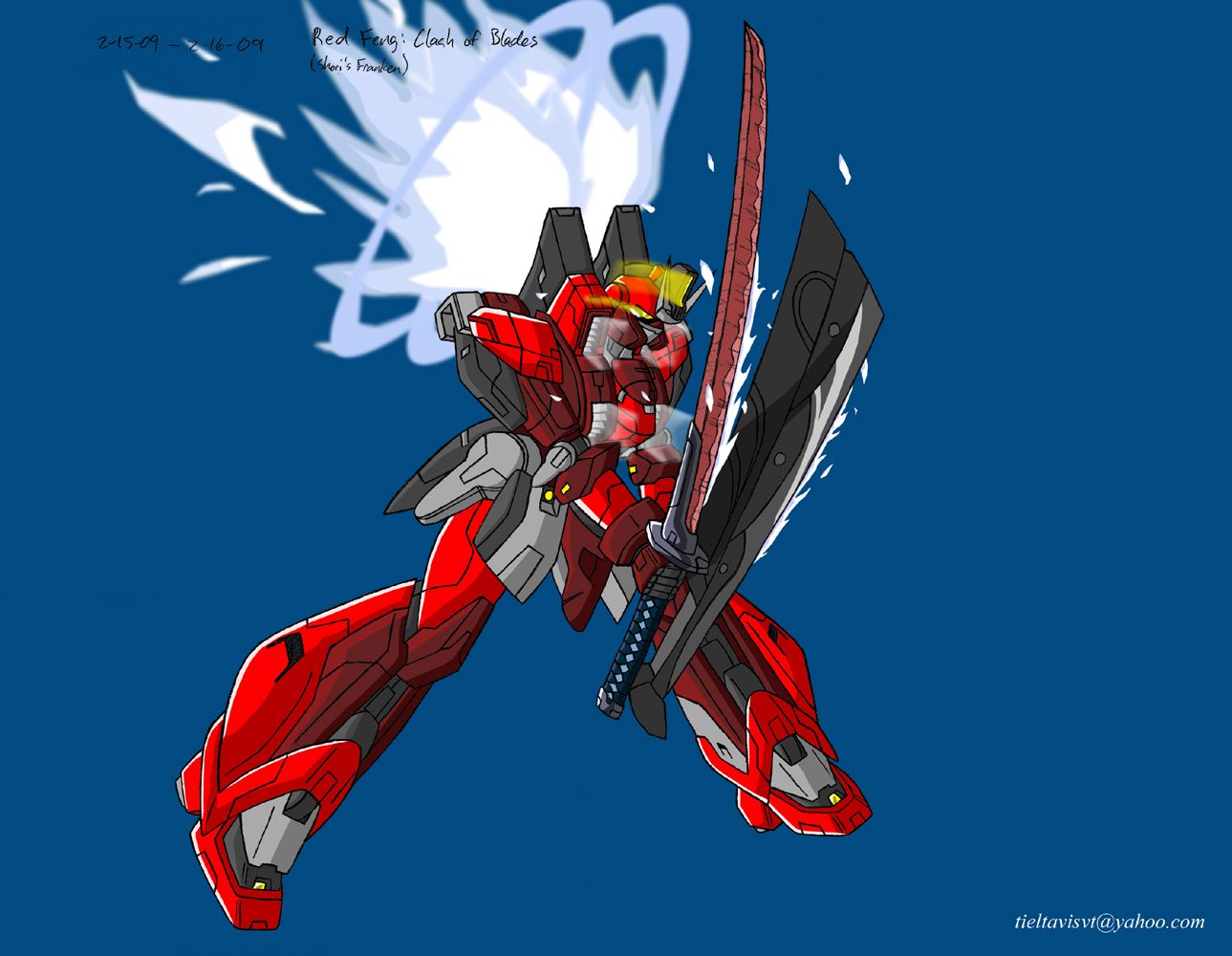
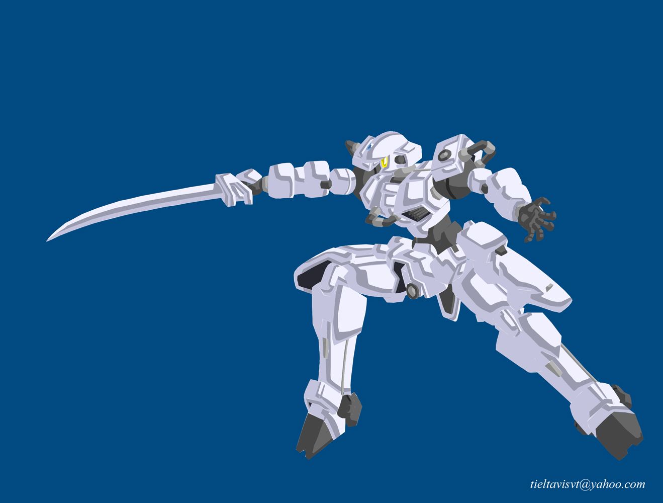
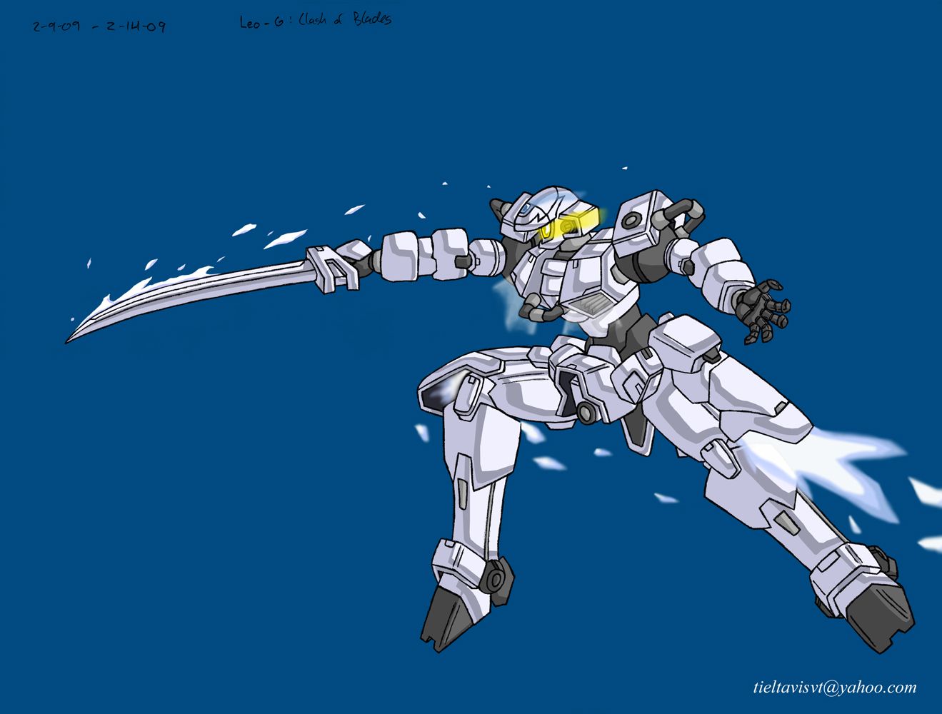
Anyway, you guys know I've been working on something, and I'll go ahead and post all the contents here:
Lineart done by pencil on copy paper, colors and effects in Shop. It's actually un-inked.
A Clash of Blades
No Lines!
Me too!
No effects
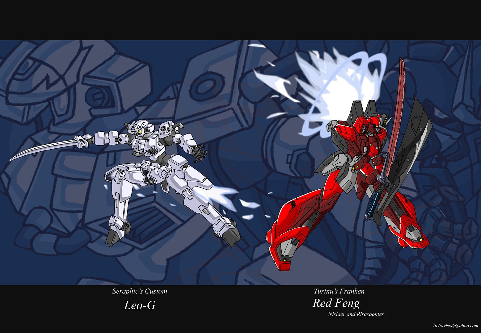
Clean version
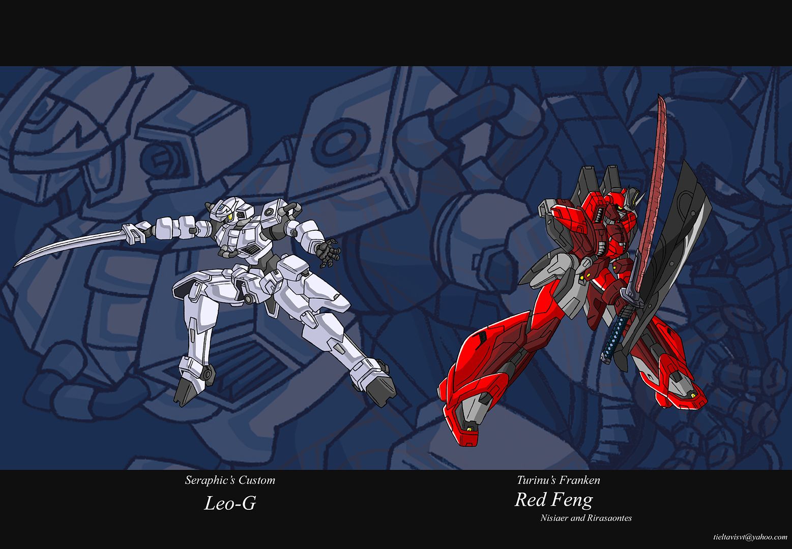
My favorite version
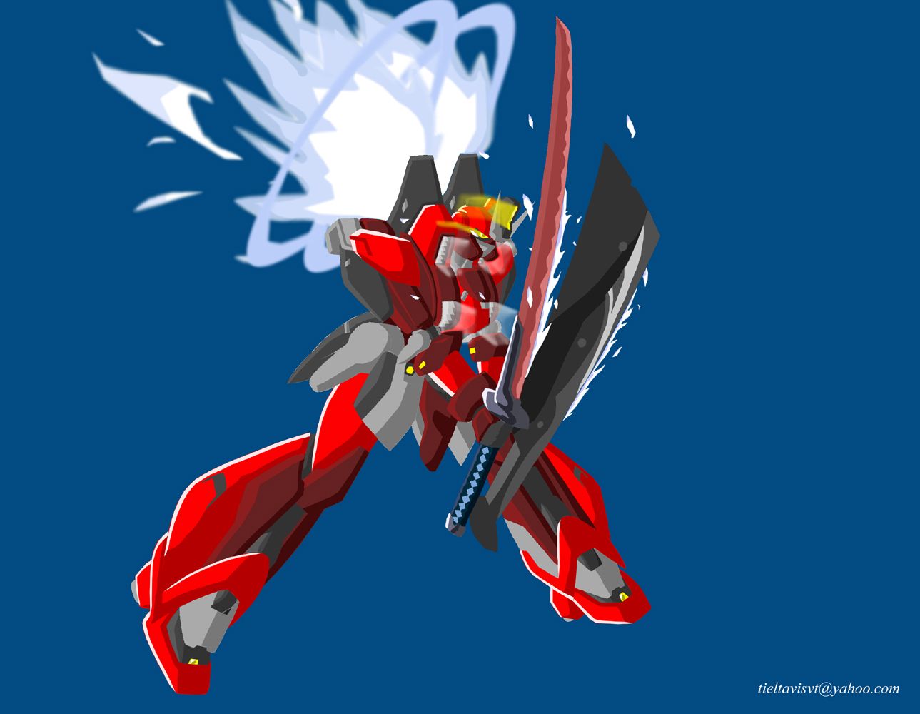
Red Feng's Lineart
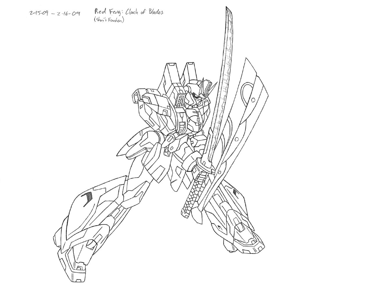
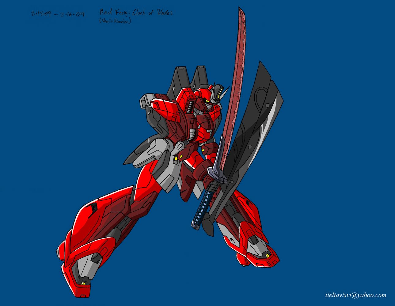
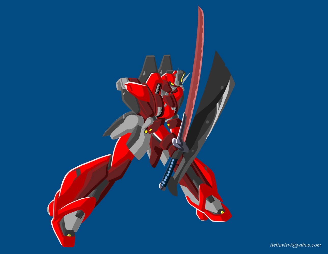
Red Feng
No lines
Effects
No lines effects
Available exclusively here:
Leo-G lineart
Leo-G
It's the freaking liquid-metal terminator!
Effects
Effects no lines
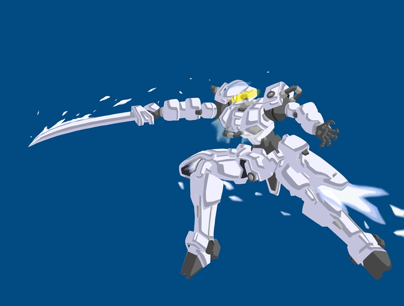
I guess there's not much point in repeating myself, but most of my thoughts can be found here. I'll tell you though, the photoshop file is spread out into 63 layers, but I think that's because I separated coloring parts into their own layers.
The Leo-G did turn out surprisingly nice, and I'm a little astounded by its elegance. When I did the shading on it, I really didn't expect it to turn out looking like it's practically glowing. Unexpected, but a nice effect. I think my favorite part of the effects are the exhaust vents, but especially the thruster inside the right leg as you see it dying out during the attack.
Mostly, are there any suggestions for improvements? I know this is far from perfect.
I'm going to start working on some character stuff now.
=o
"Red particles are bad, they mutate you into... dead? But green/blue particles are good, apparently, for reasons and for purposes yet to be determined. Isn't science sometimes nicely color-coded?"
-Antares
GW: The Sword . Sera's Art . Gameplay . The Lost Citadel
-Antares
GW: The Sword . Sera's Art . Gameplay . The Lost Citadel
-
Seraphic
- Posts: 1434
- Joined: Fri Jun 22, 2007 1:56 am
- Location: Inside the barrel of Wing Zero's left Buster Rifle.
Don't mind me. Just triple-posting. -___-;
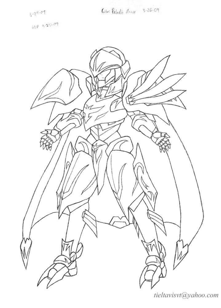
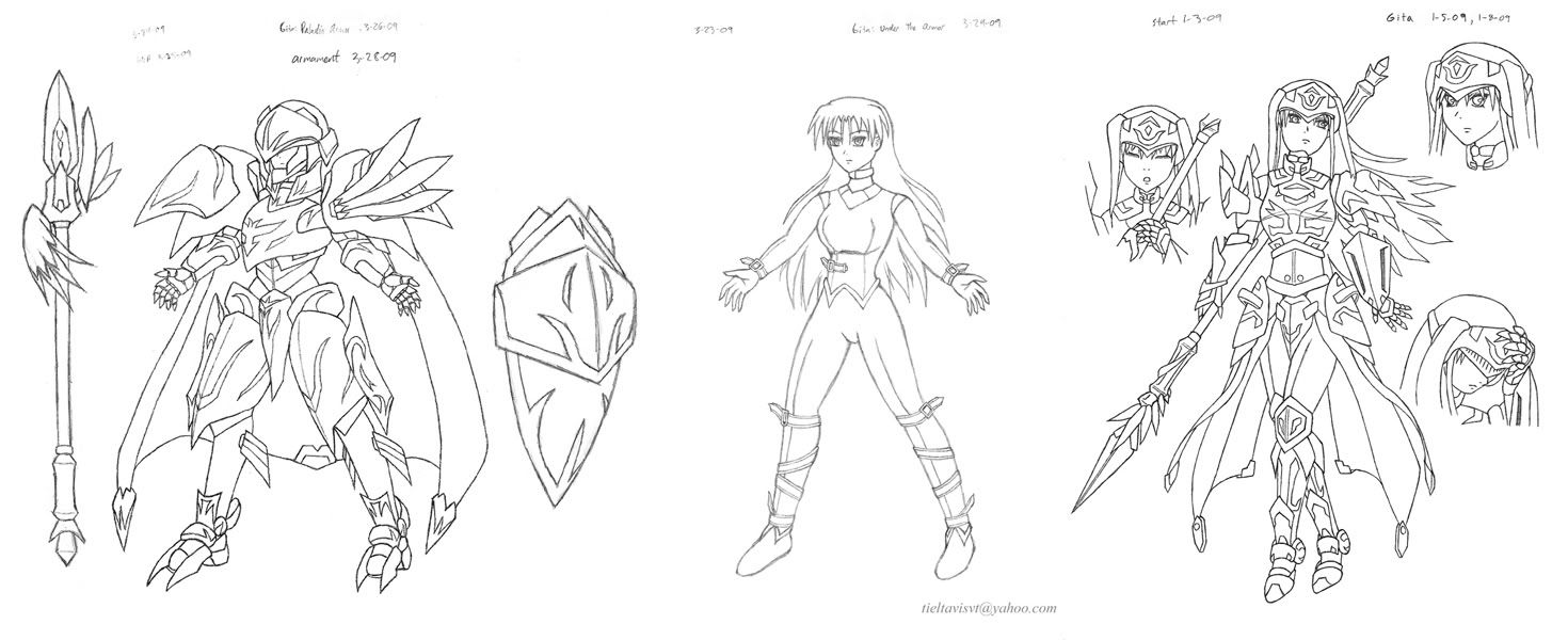
I said I would start on some character stuff. I didn't really mean to start on this certain project first thing, but I guess it just came more naturally.
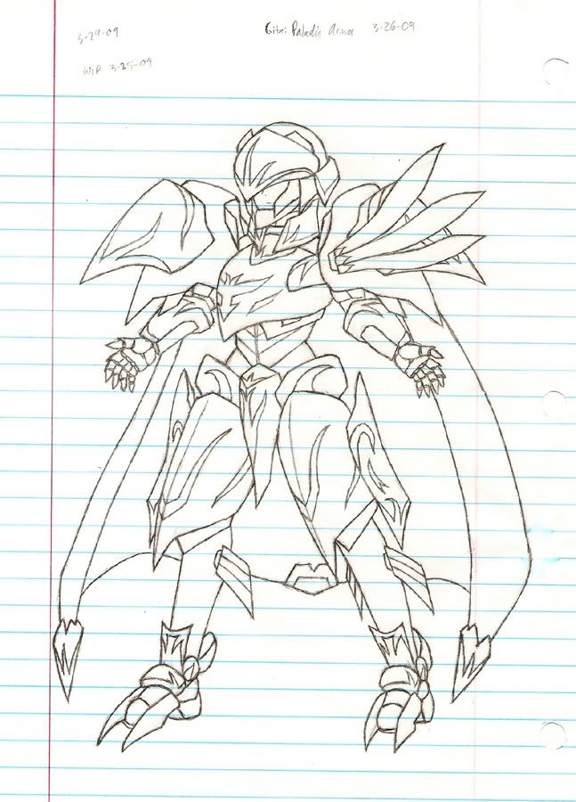
Paladin Armor. The raw scan.
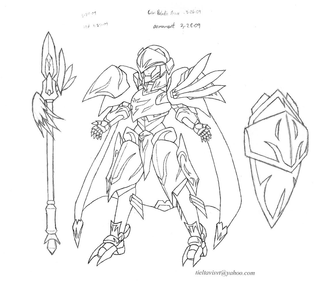
Ran out of space obviously, so I reprinted on a different sheet for the armament. Short-spear needs some work.
And you'll never guess who's under that armor. *in a creepy/haunting voice* "...Give me a hug...!" Raw scan. The stance is strange by itself, but necessary to provide enough space for the armor. At least the posture looks about accurate.
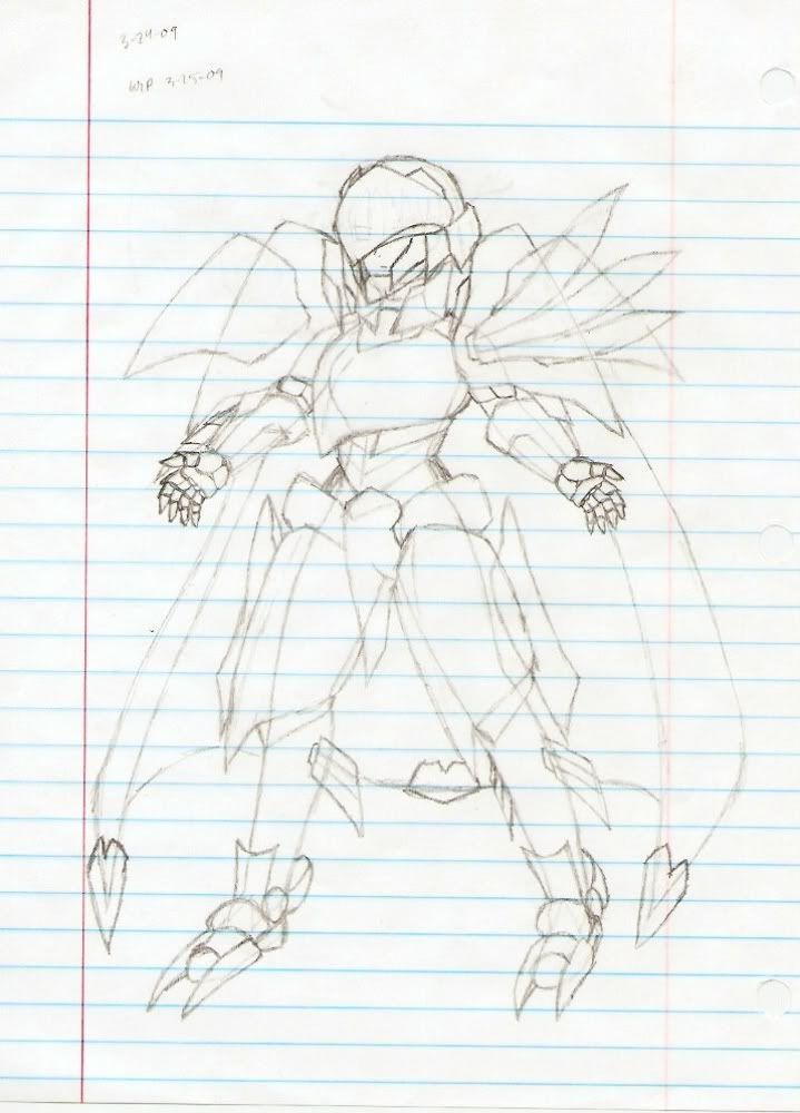
Here is the in-between step. Doing this sort of thing for armor or just wardrobe in general is good practice. I lightly traced the wearer's outline onto another sheet and sketched the armor on top of it so I can see how well it fit. You can see that the final draft has some changes, like shortened shoulder armor and heels on the boots for added height.
A page to compare everything thus far. The large Paladin Armor is a disguise. The same leather under-suit is worn for each of them. I hope Gita doesn't look too much like a power ranger...or a bondage victim.... The second one is designed for full mobility, and the spear is longer because she can freely use both hands for it.
This is about as sketchy as things get for me. I was trying to not clean things up too much so I can practice lifting sketches, but I guess you see how that went. This one might be a good candidate for coloring.
My only qualms here are the proportions on Gita. Her head is too big, and her thighs probably shorter than is the standard. I may have accidentally used Gundam proportions for her, unfortunately. You can definitely tell because of how big I had to make the helmet to fit her head. I'd say the hair is a big improvement over my previous attempt, but still nothing great. I like the helmet design.
It wasn't a completely serious project, but I could really use some reviews or pointers here.
=o
I said I would start on some character stuff. I didn't really mean to start on this certain project first thing, but I guess it just came more naturally.
Paladin Armor. The raw scan.
Ran out of space obviously, so I reprinted on a different sheet for the armament. Short-spear needs some work.
And you'll never guess who's under that armor. *in a creepy/haunting voice* "...Give me a hug...!"
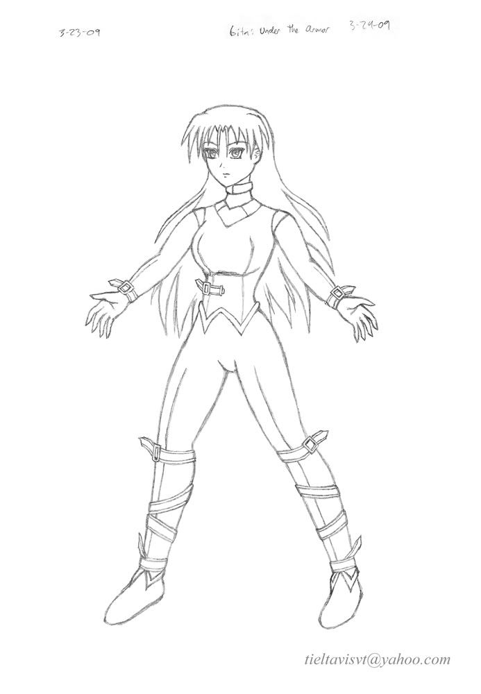
Here is the in-between step. Doing this sort of thing for armor or just wardrobe in general is good practice. I lightly traced the wearer's outline onto another sheet and sketched the armor on top of it so I can see how well it fit. You can see that the final draft has some changes, like shortened shoulder armor and heels on the boots for added height.
A page to compare everything thus far. The large Paladin Armor is a disguise. The same leather under-suit is worn for each of them. I hope Gita doesn't look too much like a power ranger...or a bondage victim.... The second one is designed for full mobility, and the spear is longer because she can freely use both hands for it.
This is about as sketchy as things get for me. I was trying to not clean things up too much so I can practice lifting sketches, but I guess you see how that went. This one might be a good candidate for coloring.
My only qualms here are the proportions on Gita. Her head is too big, and her thighs probably shorter than is the standard. I may have accidentally used Gundam proportions for her, unfortunately. You can definitely tell because of how big I had to make the helmet to fit her head. I'd say the hair is a big improvement over my previous attempt, but still nothing great. I like the helmet design.
It wasn't a completely serious project, but I could really use some reviews or pointers here.
=o
"Red particles are bad, they mutate you into... dead? But green/blue particles are good, apparently, for reasons and for purposes yet to be determined. Isn't science sometimes nicely color-coded?"
-Antares
GW: The Sword . Sera's Art . Gameplay . The Lost Citadel
-Antares
GW: The Sword . Sera's Art . Gameplay . The Lost Citadel
-
ShadowCell
- Moderator
- Posts: 4716
- Joined: Sun Mar 05, 2006 12:59 pm
- Location: California
- Contact:
On that Clash of Blades picture, you probably should have spent some time cleaning up the lineart before you blew it up for the background. I can see all the little holes and things in it, and it's sort of distracting. Images like that are where it really pays to take the time to get some clean straight lines.
Other than that, I'm down with it.
Other than that, I'm down with it.
-
Seraphic
- Posts: 1434
- Joined: Fri Jun 22, 2007 1:56 am
- Location: Inside the barrel of Wing Zero's left Buster Rifle.
Yeah, I noticed that about it, also. As mentioned before, it only shows up that way because that's the un-inked pencil work that you're seeing. Pencil always looks like that because that's literally how it looks on paper if you look close enough. >=/ I was avoiding re-inking anything, and to be honest I actually kinda enjoyed the fact that you can tell it's my original pencil work in the background. I'm dreading the day where my art becomes completely digital, and my pencil will no longer have any part in the final product. Otherwise, it's probably just poor judgment on my part, because what I like isn't the same as what a viewer may like. I guess I'll have to keep trying to get that tablet.ShadowCell wrote:On that Clash of Blades picture, you probably should have spent some time cleaning up the lineart before you blew it up for the background. I can see all the little holes and things in it, and it's sort of distracting. Images like that are where it really pays to take the time to get some clean straight lines.
Other than that, I'm down with it.
And just so this post isn't intellectually worthless, I think I have a new character designer I want to study: Kita Senri. Very functional but attractive designs. Beautiful hair, and probably the thing I like most: soft lineart. I never even thought of that. Kita probably has a pen or marker to do that stuff though, so the lineart doesn't look all full of holes close up.
Setting myself up for a double post. >,< EDIT: Haha! I win! >,<;;
Last edited by Seraphic on Sat Mar 28, 2009 7:52 pm, edited 1 time in total.
"Red particles are bad, they mutate you into... dead? But green/blue particles are good, apparently, for reasons and for purposes yet to be determined. Isn't science sometimes nicely color-coded?"
-Antares
GW: The Sword . Sera's Art . Gameplay . The Lost Citadel
-Antares
GW: The Sword . Sera's Art . Gameplay . The Lost Citadel