I don't think you need a tablet, you just need the immeasurable patience it takes to make a bajillion anchor points with the Pen tool in Photoshop. If that's what you do, then your pencil work becomes a guide for the finished product.
At least, that's what you should do if your lineart is as big and visible as it was in "Clash of Blades." Otherwise, you can probably get away with just using your pencils, as long as your lines are straight and stuff.
Seraphic's Section - digital art livestreams
-
ShadowCell

- Moderator
- Posts: 4716
- Joined: Sun Mar 05, 2006 12:59 pm
- Location: California
- Contact:
-
crashlegacy14

- Posts: 511
- Joined: Thu Nov 15, 2007 1:38 am
- Location: In the Zaku's cockpit. Yes, the one that just exploded.
- Contact:
another tip, use better paper. just look at my stuff, you cna see in the lineart which is done on "good" paper and which is done on the really cheap really thin copy paper. I find that provided you use a rather sharp pencil and half decent paper (like what you typicaly find as printer paper) you can get good results with your line art. have a dull pencil and/or bad paper and you end up with very messy looking line. -oh and don't draw while on the road...it never ends well.
another factor is the resolution of your scan. 150dpi is decent for any of your quick stuff you don't plan on making too big, but for wall paper size things you should pop up to 300dpi when scanning. this will make the iamge unessarly huge but later when you shrink it down to fit wallpaper demensions it'll compress nicely.
what do you mean "soft line art?"
Crash's Mecha Design Works
Crash's Mecha Based RPG
-----------------//-----------
ShadowCell wrote: Perspective. It's great.
CrashLegacy14 wrote: my immortal enemy: Perspective.
Crash's Mecha Based RPG
-----------------//-----------
ShadowCell wrote: Perspective. It's great.
CrashLegacy14 wrote: my immortal enemy: Perspective.
-
Seraphic

- Posts: 1434
- Joined: Fri Jun 22, 2007 1:56 am
- Location: Inside the barrel of Wing Zero's left Buster Rifle.
(fucking bullshit. I had to type this post twice because my browser decided to be a prick.)
I already realized a while ago that the paper I used was a cause of my lines looking all grainy. It's literally wide-ruled notebook paper. I only use it because I'm kinda attached to it, and it's also kinda the reason I can excuse myself from doodling in class. I'm a little sad that the paper ages very poorly. All of my old drawings have turned completely yellow, even pictures that I haven't gotten to scan for The Sword yet. I've been looking at some paper that's designed specifically for lineart and mechanical pencil work, but it looked too expensive at the time. Maybe I'll try it out soon. I couldn't draw on the road because I'd puke all over my binder. I can read just fine though. =p I can only draw when I have good light and a lot of elbow room.
I've been scanning the new stuff in hi-res and shrinking it down before posting. Like I mentioned before, the original Shop file of Clash of Blades is so big that it crashed my program a whole bunch when I messed up the image size. I can assure you that my 5mm and 3mm mechanical pencils are plenty sharp.
I already realized a while ago that the paper I used was a cause of my lines looking all grainy. It's literally wide-ruled notebook paper. I only use it because I'm kinda attached to it, and it's also kinda the reason I can excuse myself from doodling in class.
I've been scanning the new stuff in hi-res and shrinking it down before posting. Like I mentioned before, the original Shop file of Clash of Blades is so big that it crashed my program a whole bunch when I messed up the image size. I can assure you that my 5mm and 3mm mechanical pencils are plenty sharp.
Link again.crashlegacy14 wrote:what do you mean "soft line art?"
You can look through the link for examples. The picture of Mist is a good example.Colours - They are marked by bold outlines with soft colouring. These outlines are rarely solid black, if ever, and are always the colour of whatever complements the other colours used in the picture. The colours he/she uses are often organic (natural browns, reds), but he/she can bring out fresher colours as well.
"Red particles are bad, they mutate you into... dead? But green/blue particles are good, apparently, for reasons and for purposes yet to be determined. Isn't science sometimes nicely color-coded?"
-Antares
GW: The Sword . Sera's Art . Gameplay . The Lost Citadel
-Antares
GW: The Sword . Sera's Art . Gameplay . The Lost Citadel
-
crashlegacy14
- Posts: 511
- Joined: Thu Nov 15, 2007 1:38 am
- Location: In the Zaku's cockpit. Yes, the one that just exploded.
- Contact:
I'm seeing some wide changes in line with(no pun inteded) and implied lines through color shading, but I think the thing that makes the iamges feel soft is the coloring job. It looks like he might even do some shading with a .2 pencil.
Crash's Mecha Design Works
Crash's Mecha Based RPG
-----------------//-----------
ShadowCell wrote: Perspective. It's great.
CrashLegacy14 wrote: my immortal enemy: Perspective.
Crash's Mecha Based RPG
-----------------//-----------
ShadowCell wrote: Perspective. It's great.
CrashLegacy14 wrote: my immortal enemy: Perspective.
-
Seraphic
- Posts: 1434
- Joined: Fri Jun 22, 2007 1:56 am
- Location: Inside the barrel of Wing Zero's left Buster Rifle.
Re: Seraphic's Section - Huh...really...?? 3.28.09
Kita's lineart is done to blend in with the rest of the image. Sure it has bold/thick lines, but it's always a soft color that complements all the other colors. That's why I call it "soft lineart" but I often make up terms out of nowhere that no one else understands. In other work I see, the lineart is always solid black and feels like a limiting factor or a boundary on the rest of the image. Worst of all, it seems to kill a sense of life/motion in the image. That's one of the main reasons why I felt my Clash project seemed very static. I really didn't like that.
In other news, I went out to look for some paper. I got a Bristol pad with a vellum (medium) finish. I would have gotten a smooth finish pad, but those things were enormous. They're supposed to be good for pencil, but I don't know if there's a specific paper that's good for mechanical pencil. Do you guys know? I'm kinda annoyed because the paper is slightly larger than my scanner, so I have to fold/cut the edges for it to scan decently. >=( The nice thing is, the paper is acid free and it's very thick. I think it's the acid that causes it to age badly, and since it's thick it won't deform due to moisture. There's a lot of sun and humidity where I live, so hopefully this bristol paper stands a chance. I'm relatively okay with the paper, but my only main complaint is how difficult it gets to erase/clean on this paper. It smears everywhere! I also can't turn the pages easily because it's so stiff. Anyway, here's my first project on bristol, done in record time!
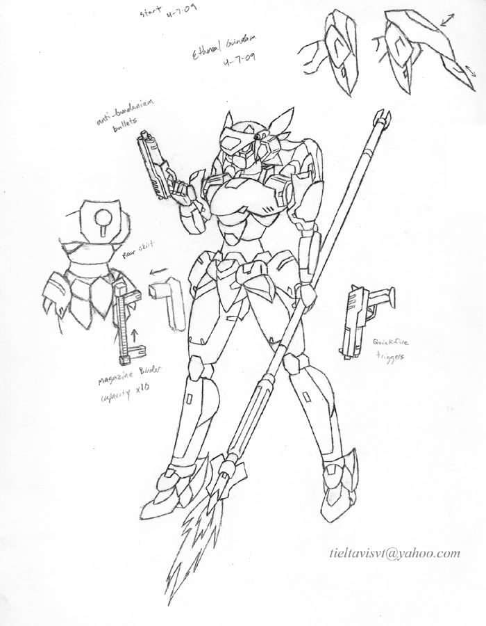
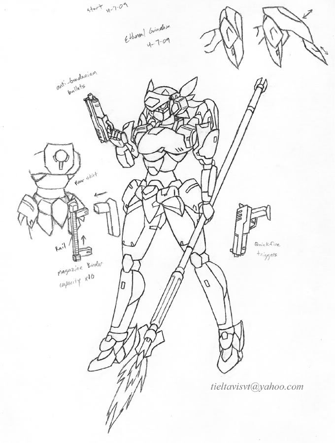
Ethereal Gundam. A unit I was going to keep secret until I unveiled it in The Sword, but oh well. I just won't release any specific info on it, but it's supposed to be one of the highest performing units in the whole narrative. I have no idea how to color this thing. -,-; Anything but pink!
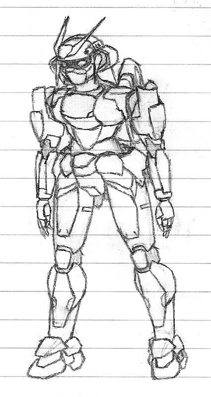
Early attempt. (VERY BAD.)
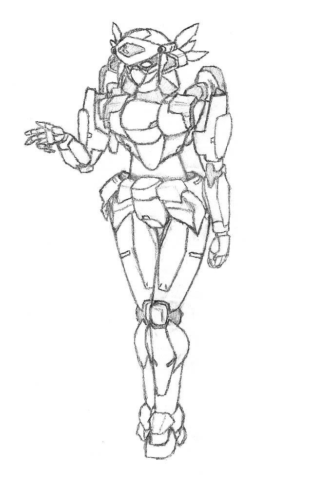
Later attempt. (...also bad.)
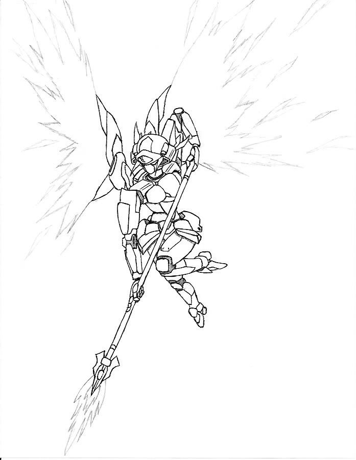
Special Move: Ether Blast! Partly inked in pen.
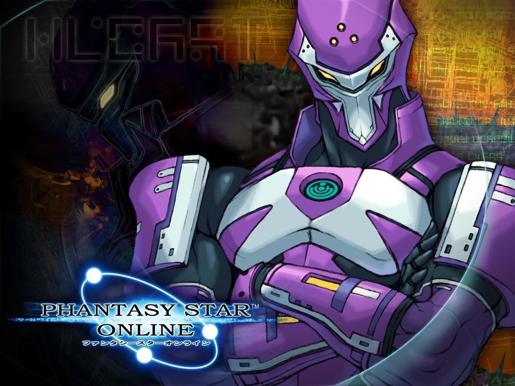
Just so you guys know, back when I was first drafting this MS, I was having a lot of trouble with its body type, so I studied some androids off of Phantasy Star Online for a bit of perspective. This class is called a RAcaseal. I just love how it looks both so organic and so mechanical at the same time. Very lovely. What I mostly got off of this was the figure and panel lines, but I guess now that I look back at this the Ethereal isn't all that similar.... Also, Kireek decided to show up just to show you how much of a badass he is.
I'll archive this project later once it's official. Does any one have any comments or suggestions for this one? I could probably use the input, since this is a pretty weird one. o_O Anyhow, a new segment I wanted to add....
Art Related Stories from Seraph's Childhood:
Back when I was in elementary, I was stuck in a program called ESL, or English as a Second Language. This was kind of weird, especially because I was one of the best spellers in my class, but apparently the school system here is just completely racist or something. >.> But more onto the point, on that day in class we were "studying" animals or pets or something, and we all drew posters. I decided to draw my pet Chihuahua at the time, Mickey. It was pretty decent, being a profile picture of him on the side. But towards the end of the class period, I looked around and saw a lot of other good posters, and I decided to one-up them and make my drawing as detailed and realistic as possible. I sketched in Mickey's penis. And why not? My dog really did have a penis.
When Miss Day caught sight of my poster, she kinda gave me a concerned look and asked to borrow my pencil. I gave it to her and she erased that part of Mickey, saying it was bad or inappropriate or something. She left it at that and went away somewhere. At the time, I didn't understand why it was inappropriate, and I was actually kinda annoyed that she fiddled with my poster. So as the bell rang and the other kids were walking out, I sketched in Mickey's penis again, but did so as hard as I could with my pencil so that it couldn't be erased again. I tossed my poster in with the others and left too.
The next day, I saw all the posters hung up in the hallway except for mine. I never got an explanation as to why mine was not there. That was pretty disappointing.
In other news, I went out to look for some paper. I got a Bristol pad with a vellum (medium) finish. I would have gotten a smooth finish pad, but those things were enormous. They're supposed to be good for pencil, but I don't know if there's a specific paper that's good for mechanical pencil. Do you guys know? I'm kinda annoyed because the paper is slightly larger than my scanner, so I have to fold/cut the edges for it to scan decently. >=( The nice thing is, the paper is acid free and it's very thick. I think it's the acid that causes it to age badly, and since it's thick it won't deform due to moisture. There's a lot of sun and humidity where I live, so hopefully this bristol paper stands a chance. I'm relatively okay with the paper, but my only main complaint is how difficult it gets to erase/clean on this paper. It smears everywhere! I also can't turn the pages easily because it's so stiff.
Ethereal Gundam. A unit I was going to keep secret until I unveiled it in The Sword, but oh well. I just won't release any specific info on it, but it's supposed to be one of the highest performing units in the whole narrative. I have no idea how to color this thing. -,-; Anything but pink!
Early attempt. (VERY BAD.)
Later attempt. (...also bad.)
Special Move: Ether Blast! Partly inked in pen.
Just so you guys know, back when I was first drafting this MS, I was having a lot of trouble with its body type, so I studied some androids off of Phantasy Star Online for a bit of perspective. This class is called a RAcaseal. I just love how it looks both so organic and so mechanical at the same time. Very lovely. What I mostly got off of this was the figure and panel lines, but I guess now that I look back at this the Ethereal isn't all that similar.... Also, Kireek decided to show up just to show you how much of a badass he is.
I'll archive this project later once it's official. Does any one have any comments or suggestions for this one? I could probably use the input, since this is a pretty weird one. o_O Anyhow, a new segment I wanted to add....
Art Related Stories from Seraph's Childhood:
Back when I was in elementary, I was stuck in a program called ESL, or English as a Second Language. This was kind of weird, especially because I was one of the best spellers in my class, but apparently the school system here is just completely racist or something. >.> But more onto the point, on that day in class we were "studying" animals or pets or something, and we all drew posters. I decided to draw my pet Chihuahua at the time, Mickey. It was pretty decent, being a profile picture of him on the side. But towards the end of the class period, I looked around and saw a lot of other good posters, and I decided to one-up them and make my drawing as detailed and realistic as possible. I sketched in Mickey's penis. And why not? My dog really did have a penis.
When Miss Day caught sight of my poster, she kinda gave me a concerned look and asked to borrow my pencil. I gave it to her and she erased that part of Mickey, saying it was bad or inappropriate or something. She left it at that and went away somewhere. At the time, I didn't understand why it was inappropriate, and I was actually kinda annoyed that she fiddled with my poster. So as the bell rang and the other kids were walking out, I sketched in Mickey's penis again, but did so as hard as I could with my pencil so that it couldn't be erased again. I tossed my poster in with the others and left too.
The next day, I saw all the posters hung up in the hallway except for mine. I never got an explanation as to why mine was not there. That was pretty disappointing.
"Red particles are bad, they mutate you into... dead? But green/blue particles are good, apparently, for reasons and for purposes yet to be determined. Isn't science sometimes nicely color-coded?"
-Antares
GW: The Sword . Sera's Art . Gameplay . The Lost Citadel
-Antares
GW: The Sword . Sera's Art . Gameplay . The Lost Citadel
-
crashlegacy14
- Posts: 511
- Joined: Thu Nov 15, 2007 1:38 am
- Location: In the Zaku's cockpit. Yes, the one that just exploded.
- Contact:
Re: Seraphic's Section - Huh...really...?? 3.28.09
Eck. still getting use to the new boards... I jsut lost my reply I typed up for you. so bullet point verson:
1) smooth Bristol paper is a good medium, yes erassing is geenraly an issue, but that's why it's often used for sketching. I perfer to use stock paper typicaly used in inkjet printers, it's smooth, durrable enough for heavy erasing whiel being much thiner (thus cheaper) then bristol. It has the same smooth finish. also reading off my strathmore sketch pad "smooth finish is excelent for mechancial pencil, pencil, pen, and ink." ironcily the cover to straphmore pads make my skin itch. weird I know.
2) I noticed recently that your lines are composed of many small heavy strokes, try using longer lighter strokes. by doing so you should beable to hatch out a pose/design, quciker identify problems and adapt. lighter lines are always easier to erase (as you pointed out with your story about mickey). when I tried to get my firend woh placed lines similarly to you to do this I told him to give up control and let your muscel memory guide you. btw, a single long stroke looks alot smoother then many smaller strokes. (since oyu mentioned smooth lineart ealier)
Crash's Mecha Design Works
Crash's Mecha Based RPG
-----------------//-----------
ShadowCell wrote: Perspective. It's great.
CrashLegacy14 wrote: my immortal enemy: Perspective.
Crash's Mecha Based RPG
-----------------//-----------
ShadowCell wrote: Perspective. It's great.
CrashLegacy14 wrote: my immortal enemy: Perspective.
-
Seraphic
- Posts: 1434
- Joined: Fri Jun 22, 2007 1:56 am
- Location: Inside the barrel of Wing Zero's left Buster Rifle.
Re: Seraphic's Section - Huh...really...?? 3.28.09
Worked on smoothing the lineart a bit. Fixed some things I didn't like. Added a few unimportant details. Seriously, if you can personally tell a difference, then you're probably a bit of a weirdo. =o This looked better before I shrinked it in Shop. Not sure why. I didn't remove the smudges, but they're almost not noticeable.
I know about heavy and light strokes. Kinda the basics, right, Crash? =p I use both kinds of strokes, but in different stages. Lately I've been sketching out general proportion and posture in light strokes, and once I get to finalizing something, I "ink" it with heavy strokes. Otherwise, it would have been too difficult to redraw Ethereal's legs three times like I had to do. Couldn't decide how long they should be. But I can only control the heavy lines well in short strokes, so that's why you might have picked up on it. (I erase all the light/sketch lines during this process.) The problem may have been very pronounced on this last project because I still wasn't used to the vellum finish on the bristol pad yet. Weirdly enough, my 3mm pencil is too sharp. (Pretty much similar to a hypodermic needle.) It kinda cuts into the bristol if I press too hard, and it tends to carve its own path instead of following the curves I'm trying to make. I've learned to make lighter strokes with my 3mm on the bristol now, because the roughness of the finish creates a dark line without a need to press hard.
I think my thread has turned into some technical help topic or something. I guess when looking at my stuff people get caught up on the technique or the problems and I don't ever get to hear much on the ideas/designs that I present on paper. It gets kinda depressing/discouraging. ~___~ I guess I'll just have to post something that'll explode someone's brain or somethingother before any one is impressed.
By the way, I think I want to take suggestions on how to color this one. No pink. Or orange. Or any weird greens.
"Red particles are bad, they mutate you into... dead? But green/blue particles are good, apparently, for reasons and for purposes yet to be determined. Isn't science sometimes nicely color-coded?"
-Antares
GW: The Sword . Sera's Art . Gameplay . The Lost Citadel
-Antares
GW: The Sword . Sera's Art . Gameplay . The Lost Citadel
-
crashlegacy14
- Posts: 511
- Joined: Thu Nov 15, 2007 1:38 am
- Location: In the Zaku's cockpit. Yes, the one that just exploded.
- Contact:
Re: Seraphic's Section - Huh...really...?? 3.28.09
Try switching to 5mm if you've cutting into the page.
I had forgot to comment on the interesting clip holder design. that and how much longer her left leg is compared to the right. even with perepctive taken into account. for a standing postion the feet are simply place too far apart.
color wise....purple...becuase world of warcraft have purmently fused the Ethereal and purple together in my mind. but purple, blue, or combinations would be good. hell covenat purple (you know what I'm talking about) and either make the color itself subdued or play up the shine. or even both.
Crash's Mecha Design Works
Crash's Mecha Based RPG
-----------------//-----------
ShadowCell wrote: Perspective. It's great.
CrashLegacy14 wrote: my immortal enemy: Perspective.
Crash's Mecha Based RPG
-----------------//-----------
ShadowCell wrote: Perspective. It's great.
CrashLegacy14 wrote: my immortal enemy: Perspective.
-
Seraphic
- Posts: 1434
- Joined: Fri Jun 22, 2007 1:56 am
- Location: Inside the barrel of Wing Zero's left Buster Rifle.
Re: Seraphic's Section - Huh...really...?? 3.28.09
Said I would be working on some character stuff.
Seraph delivers.
This is a pen sketch I did when I forgot my notebook and pencils, so I was doodling in ballpoint pen some time earlier in the semester in Vector Calculus. I've done pen sketches before, and I enjoy it, but it kinda annoys me how I seemingly get things right the first time always in pen, but when I'm using pencil I mess up so much. Weird. Go hatching!
That's Jen Aoki, also seen here at the bottom-right. As I've noted in the past, I was a little dissatisfied with her clothing, so I have been working/struggling with that some. I HAVE NO IDEA WHAT I'M DOING.
Wardrobe Troubleshooting. Used the burn tool to darken my handwriting. =) I'm working inside certain setting and character restraints, so I don't have as much creative freedom as VR might. It's funny how women can look good in weird/silly outfits, but men just look ridiculous in them. Just try watching Ah! My Goddess and say otherwise.
a) A reproduction of the pen sketch because nothing is official unless it's in pencil with me. Doesn't look as good, and I forgot the wrist cuff things. Messed up on the boots. You can tell what the colors would be using the other drawing. This isn't everyday casual wear, but just how she would dress during outings. Random hand posture!
b) Her original outfit. A golf shirt with folded up sleeves and capri pants? She looks good in capri pants. I guess the outfit's a little strange for a girl, but I feel it suits her personality. I guess the quality of this outfit purely depends on how well I draw it. -_-; A note on the expressions here, they're not meant to be looking at anything else on the page. That was completely unintentional. I think the shirt should be a dark blue with whitish pants. Tennis/walking shoes.
c) A light sweater and long sleeves. I think the sweater will be lighter in color while she has a darker undershirt. I like this one, but the posture is a little demure.... I like how the sleeves cover her hands. Remember, gentlemen, wrists are sexy. Why else does a woman look so good while she's holding a cigarette? Not trying to recommend cigs to anyone though. =p Don't know what the hell I'm talking about? Blah, just look it up.
d) Some random silk blouse that came to mind. It kinda looks like something Relena would wear, haha. It's a bit too girly for Jen. This one's out. It might be an interesting design for someone's dress, maybe. I think I should eliminate the sleeves.
e) A heavy silk shirt. The short sleeves are supposed to be kinda poofy. This one looks interesting, but it's a little too agressive. Maybe it's just how I did the posture? It's supposed to be black.
f) Jen is explaining something in her (supposed to be) black tank. Aren't you listening?? I like this one. It's casual but comfortable, though not an "all the time" deal. I'll probably have her dress like this when she's working on engineering stuff. I guess I've been practicing with hands a lot. Still not great though. Have you guys been practicing like I told you? (I'm lookin' at you, Shori!)
Anyway, guys, I think I need a lot of input or help for this. I really have no clue. I know it's weird to comment on stuff like this, this being a mecha/anime forum thing, but I'm the weirdo playing dress-up here. -_-; You should at least be able to look at a lady and know whether or not you like how she looks. Seriously, I don't care if you know how to draw or know anything about fashion or whatever. I just need opinions. Thanks very much for anything at all. Try not to dwell too much on the technical details here. -_-;
Irrelevant Horror Stories from Seraph's Childhood:
Back when I was really young, maybe about three, we lived in an apartment, nearby our uncle. One day, my sister and I go over to his place, and in front of this door he has all of these sea shells. He tells us to put the shells up to our ears and listen. I'm hearing a washy noise, but at the time I have no idea that's what the ocean is supposed to sound like, haha. So the shell I had was this spiky conch shell; it was like 6in big or something. I take it back home with me, and I'm tired, so I set the shell on the armrest of this big chair, and I fall asleep in the chair too. (This is strange, because it's my only memory of ever taking a nap in my childhood.)
Some time later, I feel like I'm falling in and out of sleep, and something is bothering me. I feel all weird like something's crawling all over me. I open my eyes a little, and it's blurry, and I see all these dots everywhere. I'm not awake enough, and fall back asleep. The weird feeling gets worse and I open my eyes again. This time I stare harder at the little dots, and they were hundreds of baby spiders.
I was so scared I didn't move. I couldn't move. I laid completely still, eyes wide, trying to figure what to do. Suddenly in one fast motion, I leap out of the chair and go a little crazy trying to swat them all off of me. After a few minutes, I look at the chair again, and it's just covered! There must have been an egg inside that conch shell, and it hatched just after I took it home with me. What luck!
I showed the spiders to my mom or dad, I forget who, and we kill all of the spiders with a can of Raid. We couldn't use that chair for a few weeks. Didn't get any bites on me at all, believe it or not.
Now, I don't fear spiders any more than the next guy, but that was a pretty unusual experience! They creep me out plenty, yeah, being all fast and having eight legs and all, but I try to avoid killing them if I can.
A useful pest tip: don't want to poison the hell out of your room just to kill one son of a bitch? Use a can of compressed air. If you hold the can upside-down and press the nozzle very lightly, it'll spray out a stream of super-cold air. It'll instantly freeze anything. It's great for immobilizing and getting rid of critters, and it has no mess afterwards. Just don't press too hard, or you'll blast the thing away with a jet of air. And don't spray people with this, because instant frost bite sucks.
=o
Seraph delivers.
This is a pen sketch I did when I forgot my notebook and pencils, so I was doodling in ballpoint pen some time earlier in the semester in Vector Calculus. I've done pen sketches before, and I enjoy it, but it kinda annoys me how I seemingly get things right the first time always in pen, but when I'm using pencil I mess up so much. Weird. Go hatching!
That's Jen Aoki, also seen here at the bottom-right. As I've noted in the past, I was a little dissatisfied with her clothing, so I have been working/struggling with that some. I HAVE NO IDEA WHAT I'M DOING.
Wardrobe Troubleshooting. Used the burn tool to darken my handwriting. =) I'm working inside certain setting and character restraints, so I don't have as much creative freedom as VR might. It's funny how women can look good in weird/silly outfits, but men just look ridiculous in them. Just try watching Ah! My Goddess and say otherwise.
a) A reproduction of the pen sketch because nothing is official unless it's in pencil with me.
b) Her original outfit. A golf shirt with folded up sleeves and capri pants? She looks good in capri pants. I guess the outfit's a little strange for a girl, but I feel it suits her personality. I guess the quality of this outfit purely depends on how well I draw it. -_-; A note on the expressions here, they're not meant to be looking at anything else on the page. That was completely unintentional. I think the shirt should be a dark blue with whitish pants. Tennis/walking shoes.
c) A light sweater and long sleeves. I think the sweater will be lighter in color while she has a darker undershirt. I like this one, but the posture is a little demure.... I like how the sleeves cover her hands. Remember, gentlemen, wrists are sexy. Why else does a woman look so good while she's holding a cigarette? Not trying to recommend cigs to anyone though. =p Don't know what the hell I'm talking about? Blah, just look it up.
d) Some random silk blouse that came to mind. It kinda looks like something Relena would wear, haha. It's a bit too girly for Jen. This one's out. It might be an interesting design for someone's dress, maybe. I think I should eliminate the sleeves.
e) A heavy silk shirt. The short sleeves are supposed to be kinda poofy. This one looks interesting, but it's a little too agressive. Maybe it's just how I did the posture? It's supposed to be black.
f) Jen is explaining something in her (supposed to be) black tank. Aren't you listening??
Anyway, guys, I think I need a lot of input or help for this. I really have no clue. I know it's weird to comment on stuff like this, this being a mecha/anime forum thing, but I'm the weirdo playing dress-up here. -_-; You should at least be able to look at a lady and know whether or not you like how she looks. Seriously, I don't care if you know how to draw or know anything about fashion or whatever. I just need opinions. Thanks very much for anything at all. Try not to dwell too much on the technical details here. -_-;
Irrelevant Horror Stories from Seraph's Childhood:
Back when I was really young, maybe about three, we lived in an apartment, nearby our uncle. One day, my sister and I go over to his place, and in front of this door he has all of these sea shells. He tells us to put the shells up to our ears and listen. I'm hearing a washy noise, but at the time I have no idea that's what the ocean is supposed to sound like, haha. So the shell I had was this spiky conch shell; it was like 6in big or something. I take it back home with me, and I'm tired, so I set the shell on the armrest of this big chair, and I fall asleep in the chair too. (This is strange, because it's my only memory of ever taking a nap in my childhood.)
Some time later, I feel like I'm falling in and out of sleep, and something is bothering me. I feel all weird like something's crawling all over me. I open my eyes a little, and it's blurry, and I see all these dots everywhere. I'm not awake enough, and fall back asleep. The weird feeling gets worse and I open my eyes again. This time I stare harder at the little dots, and they were hundreds of baby spiders.
I was so scared I didn't move. I couldn't move. I laid completely still, eyes wide, trying to figure what to do. Suddenly in one fast motion, I leap out of the chair and go a little crazy trying to swat them all off of me. After a few minutes, I look at the chair again, and it's just covered! There must have been an egg inside that conch shell, and it hatched just after I took it home with me. What luck!
I showed the spiders to my mom or dad, I forget who, and we kill all of the spiders with a can of Raid. We couldn't use that chair for a few weeks. Didn't get any bites on me at all, believe it or not.
Now, I don't fear spiders any more than the next guy, but that was a pretty unusual experience! They creep me out plenty, yeah, being all fast and having eight legs and all, but I try to avoid killing them if I can.
A useful pest tip: don't want to poison the hell out of your room just to kill one son of a bitch? Use a can of compressed air. If you hold the can upside-down and press the nozzle very lightly, it'll spray out a stream of super-cold air. It'll instantly freeze anything. It's great for immobilizing and getting rid of critters, and it has no mess afterwards. Just don't press too hard, or you'll blast the thing away with a jet of air. And don't spray people with this, because instant frost bite sucks.
=o
"Red particles are bad, they mutate you into... dead? But green/blue particles are good, apparently, for reasons and for purposes yet to be determined. Isn't science sometimes nicely color-coded?"
-Antares
GW: The Sword . Sera's Art . Gameplay . The Lost Citadel
-Antares
GW: The Sword . Sera's Art . Gameplay . The Lost Citadel
-
SolidSpidr

- Posts: 118
- Joined: Tue Mar 06, 2007 6:42 pm
- Location: Relaxing in Britannia
Re: Seraphic's Section - Troubleshooting. Please help! 4.15.09
Personally I like letter a the best. Here's an idea, put the top half of letter a with the bottom half of letter b. In my mind it seems to work but I could be wrong. Also Seraphic, don't get to worked up about posting some characters, mechs do need pilots so its nice to see what the characters that you envision look like. I also draw people and well, there better than some of my mecha I've posted, but I don't have the courage to post them up. (That reminds me, I need to update my page............)
“The school of the undefeated East!”
“The winds of the king!”
“Zenshin!”
“Keiretsu!”
“Tempa Kyoran!”
“Look! The East is burning red!”
-Master Asia
Click me!, Click me!
“The winds of the king!”
“Zenshin!”
“Keiretsu!”
“Tempa Kyoran!”
“Look! The East is burning red!”
-Master Asia
Click me!, Click me!
-
Heretic

- Posts: 644
- Joined: Sun Mar 12, 2006 9:38 pm
- Location: Behind the Sofa to escape from the Daleks.
Re: Seraphic's Section - Troubleshooting. Please help! 4.15.09
I have to say, I think you’ve done well with all the outfits. Is there a specific look you’re going for? If not, I’d recommend you try to use them all at different points.
Everything I know about rock music, I learned from K-ON!!
-
Seraphic
- Posts: 1434
- Joined: Fri Jun 22, 2007 1:56 am
- Location: Inside the barrel of Wing Zero's left Buster Rifle.
Re: Seraphic's Section - Troubleshooting. Please help! 4.15.09
You know, it wasn't until after I had made that post that I realized she could wear ALL of them if I chose to do so. It doesn't make sense for people to wear one thing all the time. Anime makes you a little stupid, apparently.  She initially started with b) which I thought looked a bit boring in the other drawing, but after doing this study, I've come to the realization that this is the outfit that still suits her best. It just needs to have the rest of the outfit visible to really sell the look. Yeah, back to square one. -,-
As for specific looks, that's the hardest thing when it comes to Jen. The qualities of her character are very subtle and atypical, so she's very hard to describe or write. Her dress is supposed to be modest and comfortable. And what's difficult is that she's not supposed to wear a skirt, so you know, that cuts out about 7/10 of my options. To be honest, a) and e) are slightly out of character for her, but I guess she undergoes some changes that lets her dress in a manner that can be cool or aggressive.
She's civilian, and while she's beautiful, she is not strikingly so. She's the sort of beauty you have to take the time to appreciate. Her personality is similar and also difficult to discuss because it can be extremely subtle and complex. She's handy and intelligent, but only if given the opportunity to learn and practice. A lot can come of her, but only if you work with her and understand her. You could say that she is the embodiment of potential.
God, do you have any idea how difficult it's going to be to write a character like that? Anyway, I appreciate the time you gentlemen took to discuss this work, and I would still welcome any additional thoughts. I know I get a little too excited everytime I finish something, so I end up writing too damn much when I post, but I'll try to take your advice, Solidspidr. I'm sure I scare away a lot of potential views like that. And you SHOULD update your thread. I'm sure it'll kick codename:v pretty hard in the balls if you do, and who wouldn't want that? =)
My next project is probably a month away from completion. God, what was I thinking?? I'll probably be doubleposting. And just so this post wasn't completely worthless:
Thiiiings. Of. Intereeeest-
If you're interested in the sort of music I listen to, I found this music video accompanied by a mix from my favorite Dj. It's definitely not my favorite song of his, but it comes with a video, so hey. Basically, I love the first minute of this. It's cool and classy. But it breaks down into some random asian drama scenes once the lyrics kick in. I have no idea what's going on. Worth the watch probably. Stevengotremix has much better stuff, and I'll probably use some of it in the gameplay thread eventually.
I don't listen to a lot of scratch, but here is Grandmaster Dj Qbert freestyling in his home. Jesus, how does he do that? I think that's a quartz crystal for purifying energy.
Not only can he scratch, but he's also a talented repairman. How does he do that with a straight face?
If you don't know just WTF that thing at the end was, it was Skratchy the Seal.
Also, how to get a 6pack in seconds, with Skratchy the Seal. Genius.
Yeah, my sense of humor's a bit weird. Remember, it's a multimedia section.
A note to friends: I just got in from doing the oil change for my car. If you don't already, you guys should definitely learn how to do this also. It saves you a lot of money and time (once you get the hang of things at least, haha) and you learn a useful skill while you're at it. I find it kinda fun. I gotta remember not to wear nice clothes when I do this though. Just ruined this good shirt of mine. >,>
"Red particles are bad, they mutate you into... dead? But green/blue particles are good, apparently, for reasons and for purposes yet to be determined. Isn't science sometimes nicely color-coded?"
-Antares
GW: The Sword . Sera's Art . Gameplay . The Lost Citadel
-Antares
GW: The Sword . Sera's Art . Gameplay . The Lost Citadel
-
Strike Zero
- Posts: 3314
- Joined: Thu Mar 09, 2006 8:49 pm
- Location: Becoming a Gundam
Re: Seraphic's Section - Troubleshooting. Please help! 4.15.09
Well, since you asked so nicely.You seem to know what you're talking about, Strike. How about looking at my stuff some? ^_^;
First off, let me say that your drawing skills exceed mine by far. You drew that with a pen while doodling in math class? Good God!
And yay! Another guy who likes to use pencil as much as me! Pens are so overrated.
If you care for my opinion on Jen Aoki, I would agree that the b) version with the collard shirt and short pants looks the best. I've never really liked the way a half-jacket looks (if you're trying to look badass, you might as well go with a normal one -- it looks badass-er!). The rest are interesting, but the down-to-earth look of her original costume just appeals to me more. Although, she probably would look pretty smexy if you switched the shirt for that tank-top too.
I'm going to be honest and say that you do better character designs than you do mecha designs. Don't get me wrong, your stuff like this look great and are well done, it's just that you seem to have a better knack for drawing people instead of giant killer robots. I'd actually like to see more of your characters colored if you could manage. T'would be neat.
That's all I got for now. Hopefully, you're able to glean... well, something from it.
Thundermuffin wrote:SETSUNA: There is no Tomino in this world.
-
crashlegacy14
- Posts: 511
- Joined: Thu Nov 15, 2007 1:38 am
- Location: In the Zaku's cockpit. Yes, the one that just exploded.
- Contact:
Re: Seraphic's Section - Troubleshooting. Please help! 4.15.09
Personaly I think the opposite. sera blends a number of influnces together rather well when he makes mecha, It's just he hasn't quite hit his style yet. (not that I know what his style is persay bet hey.) compared to his mecha designs his charactrrers seem a lot less detailed, probbably because he dosn't do much detailing with the hair or make use of folds in cloth.
First thing I've got to say is the arm lenght of the character seems off, I'm think it's about a hand lenght too short. in the A) outfit the hand looks really wonky (thats a scentific term btw). considering how you discribe the cahracter's personality I'd go with full lenght pants of various syles. and a thing to ask, what climate does the girl typicaly exist in that says alot about how she'd dress.
regarding your comment on cig holding women it's totaly a bit of sexual innuendo. and that's all I'm going to say on it.
Crash's Mecha Design Works
Crash's Mecha Based RPG
-----------------//-----------
ShadowCell wrote: Perspective. It's great.
CrashLegacy14 wrote: my immortal enemy: Perspective.
Crash's Mecha Based RPG
-----------------//-----------
ShadowCell wrote: Perspective. It's great.
CrashLegacy14 wrote: my immortal enemy: Perspective.
Re: Seraphic's Section - Troubleshooting. Please help! 4.15.09
One thing that might help your mecha design, think of implementing some real world mechanics. I mean, how does the mecha's elbow bend? And does anything obstruct the natural movement. I dont think your current stuff is terrible, or bad even, but I think you are ready to go to the next level. The next time you design a mech, think about its purpose.
For instance, is it an urban warfare specialist? then what would it need to cope in that environment? A mecha in the jungle might need some kind of machete/chainsaw to get through the foliage. A desert mecha would need a way to keep cool, and would it hide in the sand?
I would totally stick to using smooth bristol board for finished designs. And that notebook paper you like, use it only for thumbnails. Which btw, you need to do a ton of If you post your thumbnails, I promise to critique them I'll post some of mine just so ya get an idea.
And I also like to use a lead holder for my 2H lead. Very fun.
For instance, is it an urban warfare specialist? then what would it need to cope in that environment? A mecha in the jungle might need some kind of machete/chainsaw to get through the foliage. A desert mecha would need a way to keep cool, and would it hide in the sand?
I would totally stick to using smooth bristol board for finished designs. And that notebook paper you like, use it only for thumbnails. Which btw, you need to do a ton of
And I also like to use a lead holder for my 2H lead. Very fun.
-
Seraphic
- Posts: 1434
- Joined: Fri Jun 22, 2007 1:56 am
- Location: Inside the barrel of Wing Zero's left Buster Rifle.
Re: Seraphic's Section - Troubleshooting. Please help! 4.15.09
Thank you for your comments, everyone. You are men of your word! =o
I would also be surprised to know that my characters are better than my mecha. I suppose it might be because I've had more practice drawing Jen than some of the mecha. My characters can't be as detailed because I'm just getting my feet wet trying to learn how to draw them. And besides, characters don't get to have panel lines or notches to break up the geometry. =p At least I feel that I am able to translate onto paper the kind of idea or personality I am thinking of, and that counts for both my characters and MS.
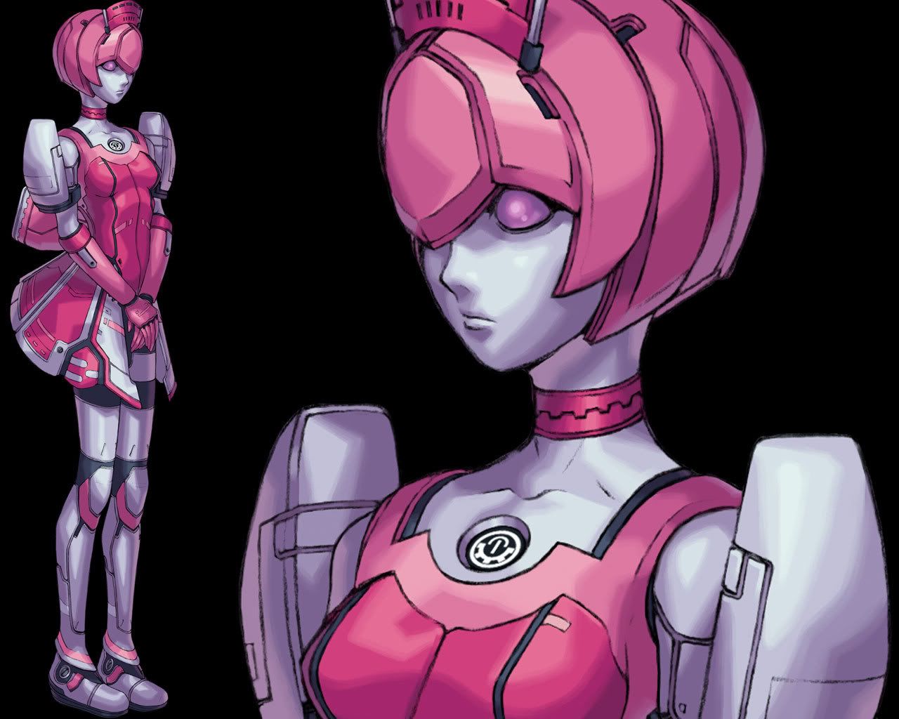
Edit: Strike, the short jacket was inspired by this. Of course I had to modify it because I didn't want to accentuate certain features. >,>; Forgive me if this makes me sound far too corny, but I simply needed a riding jacket for her, and pretty much just needed long/tough sleeves so she doesn't get wind burn. And besides, a wise man once said: It's not the leather jacket that makes you cool. It's leather sleeves. (His realization upon seeing a flamboyant man wearing a leather vest.)
Crash, I'll try to fix the proportions in later works. MS proportions, god! She's more of an indoors person, so the climate may not affect her dress too much. (And I can't always say that climate affects dress, either. Girls here in Texas wear short-shorts all the time, even when it's chilly. They're going to all catch colds! =o ) No, not when she's smoking the cigarette, but when she's just holding it in her hand. You know, this is just getting strange, so let's drop it. =p And I haven't detailed many things because I was just getting basic ideas down. I haven't formally learned how to detail hair or folds yet. Currently figuring it out. =/
Ping: engineering!! D: But that's the most tedious and un-fun part of mechanical design! I agree with you, but going that deep into things tends to hurt my head. When I'm designing, I'm worried about performance and "persona" which I am typically able to accomplish. My loser grunts look like loser grunts and my ace MS look like ace material. But yeah, I'll agree that I'm very mediocre in skill. It's not bad enough for anyone to offer real tips, but not good enough to impress many people, either. That's why I'm often overlooked. =p I have a high dislike for certain-environment-only designs. Their limitations annoy me a lot (things like G-UNIT and striker packs....) That's why I tend to design mostly general purpose MS with optional weapons. I'm thinking more about combat role and performance rather than environment. Included in that optional equipment is a large variety of stuff for different fighting conditions, however.
I would like to see some of your thumbnails, if only to know what you mean exactly by a "thumbnail". =p And when does something stop becoming a pencil and starts being a "lead holder" I wonder. That's why I bought a 3mm PENCIL rather than that 2mm LEAD HOLDER, haha. I'll go with what I know!
And now for a distraction: How does this make you feel?
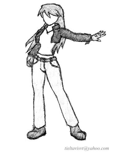
Tried more detail to make Crash happy, but I obviously don't know what I'm doing. I didn't know her hairdo was that interesting. The detail here sorta clashes what what is supposed to be a simplistic appearance. I just eyeballed the desk, but I probably should have used a ruler. Various problems everywhere.
The spoken line comes from how I break awkward silences or start awkward conversations. It's great for doing RE5 co-op, since you're killing zombies right and left, and it's suddenly really quiet and strange when you get into an elevator, and it's just you and your partner. >,>; It originates from this. You should also watch the whole video later, and the other 4 videos in the series. =)
On an unrelated note: I spent half of my weekend looking for this picture on fukung. It's wonderful, isn't it? I could do without the text though, so I wonder if it's possible to find the original. I literally searched through 1200+ pages of thumbnails to find it. The plan was to have two pages open, one starting at the beginning and one at the end, with the intention of converging on page 800. The picture was on page 774. >,<; Worth it? Probably.
And sorry for not posting up any mecha for a while. I'm sure some of you are starting to get annoyed with all these girlies. Unfortunately the next mecha piece can't be posted until I finish my animation. That could be a month away. Just sit tight and relax until then. Comment and critique at your leisure. =o
I would also be surprised to know that my characters are better than my mecha. I suppose it might be because I've had more practice drawing Jen than some of the mecha. My characters can't be as detailed because I'm just getting my feet wet trying to learn how to draw them. And besides, characters don't get to have panel lines or notches to break up the geometry. =p At least I feel that I am able to translate onto paper the kind of idea or personality I am thinking of, and that counts for both my characters and MS.
Edit: Strike, the short jacket was inspired by this. Of course I had to modify it because I didn't want to accentuate certain features. >,>; Forgive me if this makes me sound far too corny, but I simply needed a riding jacket for her, and pretty much just needed long/tough sleeves so she doesn't get wind burn. And besides, a wise man once said: It's not the leather jacket that makes you cool. It's leather sleeves. (His realization upon seeing a flamboyant man wearing a leather vest.)
Crash, I'll try to fix the proportions in later works. MS proportions, god!
Ping: engineering!! D: But that's the most tedious and un-fun part of mechanical design! I agree with you, but going that deep into things tends to hurt my head. When I'm designing, I'm worried about performance and "persona" which I am typically able to accomplish. My loser grunts look like loser grunts and my ace MS look like ace material. But yeah, I'll agree that I'm very mediocre in skill. It's not bad enough for anyone to offer real tips, but not good enough to impress many people, either. That's why I'm often overlooked. =p I have a high dislike for certain-environment-only designs. Their limitations annoy me a lot (things like G-UNIT and striker packs....) That's why I tend to design mostly general purpose MS with optional weapons. I'm thinking more about combat role and performance rather than environment. Included in that optional equipment is a large variety of stuff for different fighting conditions, however.
I would like to see some of your thumbnails, if only to know what you mean exactly by a "thumbnail". =p And when does something stop becoming a pencil and starts being a "lead holder" I wonder. That's why I bought a 3mm PENCIL rather than that 2mm LEAD HOLDER, haha. I'll go with what I know!
And now for a distraction: How does this make you feel?
Tried more detail to make Crash happy, but I obviously don't know what I'm doing. I didn't know her hairdo was that interesting. The detail here sorta clashes what what is supposed to be a simplistic appearance. I just eyeballed the desk, but I probably should have used a ruler. Various problems everywhere.
The spoken line comes from how I break awkward silences or start awkward conversations. It's great for doing RE5 co-op, since you're killing zombies right and left, and it's suddenly really quiet and strange when you get into an elevator, and it's just you and your partner. >,>; It originates from this. You should also watch the whole video later, and the other 4 videos in the series. =)
On an unrelated note: I spent half of my weekend looking for this picture on fukung. It's wonderful, isn't it? I could do without the text though, so I wonder if it's possible to find the original. I literally searched through 1200+ pages of thumbnails to find it. The plan was to have two pages open, one starting at the beginning and one at the end, with the intention of converging on page 800. The picture was on page 774. >,<; Worth it? Probably.
And sorry for not posting up any mecha for a while. I'm sure some of you are starting to get annoyed with all these girlies. Unfortunately the next mecha piece can't be posted until I finish my animation. That could be a month away. Just sit tight and relax until then. Comment and critique at your leisure. =o
"Red particles are bad, they mutate you into... dead? But green/blue particles are good, apparently, for reasons and for purposes yet to be determined. Isn't science sometimes nicely color-coded?"
-Antares
GW: The Sword . Sera's Art . Gameplay . The Lost Citadel
-Antares
GW: The Sword . Sera's Art . Gameplay . The Lost Citadel
Re: Seraphic's Section - Troubleshooting. Please help! 4.15.09
I think that girl came out pretty good! nice jehuty
As far as engineering, well general purpose can still be thought of as a specialization. As far as it not being fun, as far as drawing goes, you have to find something you like about every drawing, that makes it easier.
For a general purpose mech, you'll need far and close range weapons, decent armor, decent speed. But it doesnt excel at any one thing. I find having more focus makes a mech more interesting. You know, character and everything.
-
Seraphic
- Posts: 1434
- Joined: Fri Jun 22, 2007 1:56 am
- Location: Inside the barrel of Wing Zero's left Buster Rifle.
Re: Seraphic's Section - Troubleshooting. Please help! 4.15.09
Thanks. =) I think I meant to say general environment and not "general purpose". Typically, most things can operate both in space and atmosphere. Everything I design usually has an extremely specific combat role and an appropriate level of performance. The Ethereal Gundam found earlier on the page excels at close-range, but often performs well at middle range. It does that by using the most powerful drive system available along with an extremely light frame. It uses a spear to take advantage of range and leverage. There are several more amazing things about it, and I could write a book explaining everything, but I'll save that for later. The main point is that the Ethereal has extremely low destructive power, but can be nigh impossible to beat due to the skill of the pilot. I have a lot of "highly specialized" Gundams, but I haven't gotten to redraw them. No time!! D: o,<;TGping wrote:I think that girl came out pretty good! nice jehuty
As far as engineering, well general purpose can still be thought of as a specialization. As far as it not being fun, as far as drawing goes, you have to find something you like about every drawing, that makes it easier.
For a general purpose mech, you'll need far and close range weapons, decent armor, decent speed. But it doesnt excel at any one thing. I find having more focus makes a mech more interesting. You know, character and everything.
"Red particles are bad, they mutate you into... dead? But green/blue particles are good, apparently, for reasons and for purposes yet to be determined. Isn't science sometimes nicely color-coded?"
-Antares
GW: The Sword . Sera's Art . Gameplay . The Lost Citadel
-Antares
GW: The Sword . Sera's Art . Gameplay . The Lost Citadel
-
Strike Zero
- Posts: 3314
- Joined: Thu Mar 09, 2006 8:49 pm
- Location: Becoming a Gundam
Re: Seraphic's Section - Troubleshooting. Please help! 4.15.09
I figured as much -- the Major is the first character I ever saw wearing one (and probably the only one for that matter). Still, the original I feel works because it's not trying to be a jacket, its more like just a pair of shoulders and sleeves. The one you designed looks like somebody took a normal jacket and cut it short -- a literal "half jacket" -- and it looks odd for some reason I can't quite place my finger on.Seraphic wrote:Edit: Strike, the short jacket was inspired by this. Of course I had to modify it because I didn't want to accentuate certain features. >,>; Forgive me if this makes me sound far too corny, but I simply needed a riding jacket for her, and pretty much just needed long/tough sleeves so she doesn't get wind burn. And besides, a wise man once said: It's not the leather jacket that makes you cool. It's leather sleeves. (His realization upon seeing a flamboyant man wearing a leather vest.)
Not that I'm telling you how to fashion design, mind you -- I can't say that the outfits I've come up with for characters are any better.
At first, though I wanted to respond to that, I wasn't quite sure how to until I read your next post. Then it clicked.Seraphic wrote:Ping: engineering!! D: But that's the most tedious and un-fun part of mechanical design! I agree with you, but going that deep into things tends to hurt my head. When I'm designing, I'm worried about performance and "persona" which I am typically able to accomplish. My loser grunts look like loser grunts and my ace MS look like ace material. But yeah, I'll agree that I'm very mediocre in skill. It's not bad enough for anyone to offer real tips, but not good enough to impress many people, either. That's why I'm often overlooked. =p
If you're trying to generate a specific type of "persona" when designing a mecha, it may behoove you to forget about "combat role" altogether. Focus instead on what gives the mecha more than half its persona to begin with: its pilot. Think of its pilot, his/her character, then think of what kind of suit he/she is going to be piloting. If all you've got is "generic army grunt" or "lead hero character", that's admittedly not much to go on, but some of the most fun I've had when hand-drawing robots is when I draw stuff for a unique, at least semi-developed character. Ask yourself, "What kind of fighter is he/she? What kind of weapons would he/she use?" Even if some of the answers you come up with don't make much technical sense, draw them anyway. You'll end up putting a bit of the character into the robot design, and sometimes the robot ends up becomes a character unto itself (one prime example would be the Union Flag and Masurao from Gundam 00, if you've seen it. Every bit of Graham's character became emulated in the Flag as time passed, taken to far extremes by the end of S2 where the Masurao was revealed to be a masked Flag. That was one of the things that made me love the Flag so, even more than it just being a cool and unique design). What results is a design that's both unique and interesting and has "life", for lack of a better word, and looks meaningful even if the casual viewer doesn't know its backstory to begin with.Seraphic wrote:Everything I design usually has an extremely specific combat role and an appropriate level of performance. The Ethereal Gundam found earlier on the page excels at close-range, but often performs well at middle range. It does that by using the most powerful drive system available along with an extremely light frame. It uses a spear to take advantage of range and leverage. There are several more amazing things about it, and I could write a book explaining everything, but I'll save that for later. The main point is that the Ethereal has extremely low destructive power, but can be nigh impossible to beat due to the skill of the pilot.
Just something to think about.
....Seraphic wrote:And now for a distraction: How does this make you feel?
....Huh? Oh, sorry. Lost my train of thought for a sec there.
Thundermuffin wrote:SETSUNA: There is no Tomino in this world.
-
crashlegacy14
- Posts: 511
- Joined: Thu Nov 15, 2007 1:38 am
- Location: In the Zaku's cockpit. Yes, the one that just exploded.
- Contact:
Re: Seraphic's Section - 10,000 Views?! 5.6.09
the fold on her right shoulder is actually depremental, as it makes the arm look incorrectly jointed to her body, the neck seems a bit off and the arms, particullary her right upper arm seems just a tad short. you probably should have used a reference for that arm as the elbow region looks a big odd. her neck, and I noticed this in the previosu drawing, looks off, I think you're adding the detail lines of the neck a bit off base, they ussualy eextend from the dip where the two collar bones meet so the lines shouk coverge a bit higher up on the character's body. obviosuly you need work on your cloth folds, particuaraly where many bunch together (armpit)
Random Tutorial links
General Tutorials
http://www.howtodrawmanga.com/howtodraw ... orial.html
http://www.polykarbon.com/tutorials/index.htm
Hair Tutorials
http://sai-manga-tuts.deviantart.com/ar ... -1-7979106
http://crysa.deviantart.com/art/Drawing ... s-34535785
Random Tutorial links
General Tutorials
http://www.howtodrawmanga.com/howtodraw ... orial.html
http://www.polykarbon.com/tutorials/index.htm
Hair Tutorials
http://sai-manga-tuts.deviantart.com/ar ... -1-7979106
http://crysa.deviantart.com/art/Drawing ... s-34535785
Crash's Mecha Design Works
Crash's Mecha Based RPG
-----------------//-----------
ShadowCell wrote: Perspective. It's great.
CrashLegacy14 wrote: my immortal enemy: Perspective.
Crash's Mecha Based RPG
-----------------//-----------
ShadowCell wrote: Perspective. It's great.
CrashLegacy14 wrote: my immortal enemy: Perspective.