Josh's Old Franken Thread

The place to share your artwork.
Post Reply
User avatar
The Big Zabowski
Posts: 1950
Joined: Mon Mar 06, 2006 6:07 pm
Location: In the cockpit..

That's the thing, I hate PS for the life of me as I got my start and work well with Paint. I guess it's just my not being able to get used to the software, of which I use mostly for paint recoloring and such. If I could get lines and such to work for me in PS then I would probably be using it :D

One of these days though, I'll get off my duff and finish that franken that I started in PS all those moons ago.

But right now, I'm teaching myself acoustic guitar..one thing at a time it seems.. :P

Oh, and be on the look out one of these days for a CAD rendered Ship or such, as I am hoping to snag a copy of AutoCAD or any 2/3D image software to put my Engineering Graphics skills to practical use for the time being before they become inundated by airframe part renderings. ^^
TRANS AM!
Yes, it's a V8.
Yes, it was a Trans Am before there was "TRANS AM."
Yes, it's mine. 8)
User avatar
Yuusha Tokkyu Might Gaine
Posts: 2517
Joined: Sat Aug 26, 2006 12:25 am
Location: The big doomsday rock

My only complaint with frankening on MSpaint is that you can't seem to get the colors the way you want it too sometimes. That, and its virtually impossible to paint anything white, without making it look like you're erasing it
Tell me bats, what are you really scared of? Failure to save this cesspool of a city? Not finding the Commissioner in time? Me, in a thong?-Joker Arkham Asylum

My father was a wheel! THE FIRST WHEEL! And you know what he transformed into?! NOTHING! But he did it with honor!-Jefire, Transformers 2
User avatar
Josh
Posts: 219
Joined: Tue Mar 07, 2006 5:18 pm

Heh, yeah Photoshop really just needs time and eventually you should get used to it. Hell I felt like uninstalling the program a few times back when I first got 7.0 out of frustration. But now Photoshop is by far my best friend on my dear computer.

It really isn't that hard to emulate the Simmons line-style (that's what I call it :P ); basic knowledge of the line tool is all you really need. Then just take a close look at the lines and just try to make yours look as much like them as possible. Although it isn't bad if you want to kind of redo em yourself for a better and more clean look. Coloring can also be somewhat of a pain for me. Sometimes the lines are messed up when doing my traditional way of recoloring parts. There's probably a way to get past this but it really isn't much of a problem to me anymore.
User avatar
Turinu
Posts: 1809
Joined: Sat Mar 11, 2006 5:10 pm
Location: Florida
Contact:

Josh wrote:Heh, yeah Photoshop really just needs time and eventually you should get used to it. Hell I felt like uninstalling the program a few times back when I first got 7.0 out of frustration. But now Photoshop is by far my best friend on my dear computer.
I find that Photoshop 4.0 is probably the easiest to use when it comes to utilizing basic functions. It's easy to understand and access all the tools you need when it comes to frankening.

However, now I have to deal with this highly confusing Photoshop CS 2 thing which I have near to no clue on how to properly utilize. D:

Paired with programs like IrfanView and MSPaint though, I still manage to get the job done. :D
User avatar
Josh
Posts: 219
Joined: Tue Mar 07, 2006 5:18 pm

Shori wrote:
Josh wrote:Heh, yeah Photoshop really just needs time and eventually you should get used to it. Hell I felt like uninstalling the program a few times back when I first got 7.0 out of frustration. But now Photoshop is by far my best friend on my dear computer.
I find that Photoshop 4.0 is probably the easiest to use when it comes to utilizing basic functions. It's easy to understand and access all the tools you need when it comes to frankening.

However, now I have to deal with this highly confusing Photoshop CS 2 thing which I have near to no clue on how to properly utilize. D:

Paired with programs like IrfanView and MSPaint though, I still manage to get the job done. :D
Haha, the oldest version of Photoshop I've ever used was 5.5. I find each new version of Photoshop only adds onto what already is there and doesn't change around too much stuff. I'm sure going from 4.0 to CS2 though without any experience with version inbetween can be tough.
User avatar
Josh
Posts: 219
Joined: Tue Mar 07, 2006 5:18 pm

http://img248.imageshack.us/img248/3724 ... opyxz8.jpg

Absolution Reneaux Use - C-GPFB MKII Beam Rifle and custom "Dark History" crest shield.

(C-GPFB stands for Compact-Guided-Prescision-Focused-Beam)
So you can pretty much assume the rifle is intended to be a powerful weapon with the ability to function as a sniper rifle. The drawback is that the rifle requires reloading after 6 shots (which is low). It can reload in two different ways. Through the handle of the rifle it connects directly into the hand, providing a link to the Absolution's main power source, which it can draw energy from to reload. Or the manual way, by removing the energy clip (the wedge at the end of the rifle) and replacing it with a spare hidden behind the shield (4 clips in all, not including the one already in use).

The "Dark History" shield is still kind of hazy in terms of how I want to define it. Certainly the name "Dark History" implies some relation to the Turn A universe theory (which I currently want my story to take place around, after Turn A).

Might make a heavy weapon as well. But I will probably start on the other two Absolutions first.
EZero8
Moderator
Posts: 1771
Joined: Tue Mar 28, 2006 12:42 am

It looks great with the weapons. The shield is nicely decorated and the rifle is frankened perfectly.
ShadowCell wrote:"Poor fool, ShadowCell!" you say. "You can't win against fandom stupidity with the Power of the Mod!"
User avatar
Ascension
Posts: 1474
Joined: Wed May 31, 2006 11:50 pm

The Absolution just keeps getting better! :D
Don't call it a comeback...
...in fact, it's best if you forget I was ever here before.
User avatar
Yuusha Tokkyu Might Gaine
Posts: 2517
Joined: Sat Aug 26, 2006 12:25 am
Location: The big doomsday rock

I agree with Ezero8, I love the shield the most about this design. the colors match up pretty well too. I like how it looks like it could be some sort of police-type mech.
Tell me bats, what are you really scared of? Failure to save this cesspool of a city? Not finding the Commissioner in time? Me, in a thong?-Joker Arkham Asylum

My father was a wheel! THE FIRST WHEEL! And you know what he transformed into?! NOTHING! But he did it with honor!-Jefire, Transformers 2
User avatar
Josh
Posts: 219
Joined: Tue Mar 07, 2006 5:18 pm

whut, characters

Sebastian Velroyce - Ace Pilot that goes by the nickname "Space Cowboy" for his reckless attitude in and out of battle and known to always roll a set of dice to decide how well he'll fair in his Absolution.

Misha Alastera - Ace pilot that goes by the nickname "Purple Rose" for her odd purple hair and flashy personal apperance in her custom made service attire, while she often likes to make sure her enemies see she's a pretty, young woman, her attitude in battle is unstable at times and she is prone to going berserk when she misses her target one too many times. Once the Absolution Gundam's are produced and the three pilots are brought together to form the special advanced operations team, she soon falls in love with Sebastian and is quick to come to his aid in battle.


Guess this pretty much confirms I'm attempting to create a fanfic for my designs. I have to redo my main character Remil though, I messed up quite a bit.

Edit: Guess I should put design notes.

These were all made from modding GProject's character images and my personal touch on some spots.

Sebastian - Sebastian is simply Zeta Amuro's body and Zeta Kai's head. I edited the jawline on Kai because I felt it was too blocky and I wanted a more skinnier look. The hair is really originally Quattro's but I modded it so much it really looks nothing like his anymore now does it? :P The mods to the jacket were just to give it some originality, and I think it works well and gives him a sort of cowboy look which led to me getting the "Space Cowboy" nickname.

Misha - Misha is a combination of 0079 Fraw Bow's head and 0079 Sayla's body. Originally I had planned to use 0079 Mirai's body but it looked too stocky and I didn't like how her chest looked. The hair is Fraw's just heavily modded, and the lips were redone to make it look more like a sort of semi-grin with lipstick. I modded the pants and bottom half of the jacket into a skirt and tights, simply because I wanted this character to have sex appeal.
User avatar
Josh
Posts: 219
Joined: Tue Mar 07, 2006 5:18 pm

Sebastian's Absolution

Was originally going to go with a red and black color scheme, but the gold I had put around it made it look too Trombe-ish to me so I just desaturated it. I think it looks pretty good with the red visor.
EZero8
Moderator
Posts: 1771
Joined: Tue Mar 28, 2006 12:42 am

:shock:

Wow... that is some simply kickass coloring... teach me!!! XD

Anyways, the dark coloring looks great on the unit. Definately suits the "bad guy" customized version of a mech. Cant wait to see the weapons on it. 8)
ShadowCell wrote:"Poor fool, ShadowCell!" you say. "You can't win against fandom stupidity with the Power of the Mod!"
User avatar
Josh
Posts: 219
Joined: Tue Mar 07, 2006 5:18 pm

I haven't abandoned the Absolutions yet and still have a few more suits in progress, but I think after those are done or I give up on them, that's the last I'll be doing any frankening with G-Project's images.

With help from Shori, and the customization guide, I've created my first franken using images NOT from Gundam Project. I've officially moved onto the tracing style of frankening I see is more popular here than G Project frankening.

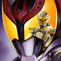
Here it is, the Drone

I know it may be kind of small but that was my fault for not taking into account the size it would be until I was near finished. And the colors while not looking exactly like they did on my laptop (which they never do :/) I think came off pretty decent. However, I probably made a few mistakes as I rushed all night to get this finished.

Also does it seem blurry? I'm not sure if it's just my eyes needing to close for about 12 hours or the crappy e-machine I'm posting on but to me it looks like the gausian blur I applied to the outline just looked more crisp on the laptop.

Also expect me to edit my first post of this thread to create an index of all my stuff, eventually.
User avatar
Turinu
Posts: 1809
Joined: Sat Mar 11, 2006 5:10 pm
Location: Florida
Contact:

Josh wrote:I know it may be kind of small but that was my fault for not taking into account the size it would be until I was near finished. And the colors while not looking exactly like they did on my laptop (which they never do :/) I think came off pretty decent. However, I probably made a few mistakes as I rushed all night to get this finished.

Also does it seem blurry? I'm not sure if it's just my eyes needing to close for about 12 hours or the crappy e-machine I'm posting on but to me it looks like the gausian blur I applied to the outline just looked more crisp on the laptop.
There shouldn't be a need to blur the outline you make in Adobe... the line tool you use should automatically be "Anti-Aliased" to give it a better look. The lines also look a little thick, you should stick to size 1 with the line tool; either that, or the thick look of the lines was caused by the blurring.

Overall, for a first attempt it's very good. You've got the basics down and all you need to do now is, practice, practice, practice to perfect the style.
User avatar
Josh
Posts: 219
Joined: Tue Mar 07, 2006 5:18 pm

Shori wrote:
Josh wrote:I know it may be kind of small but that was my fault for not taking into account the size it would be until I was near finished. And the colors while not looking exactly like they did on my laptop (which they never do :/) I think came off pretty decent. However, I probably made a few mistakes as I rushed all night to get this finished.

Also does it seem blurry? I'm not sure if it's just my eyes needing to close for about 12 hours or the crappy e-machine I'm posting on but to me it looks like the gausian blur I applied to the outline just looked more crisp on the laptop.
There shouldn't be a need to blur the outline you make in Adobe... the line tool you use should automatically be "Anti-Aliased" to give it a better look. The lines also look a little thick, you should stick to size 1 with the line tool; either that, or the thick look of the lines was caused by the blurring.

Overall, for a first attempt it's very good. You've got the basics down and all you need to do now is, practice, practice, practice to perfect the style.
The reason the lines came out thick is because I multiplied the outline's layer twice because I though just the one pixel line was just too light. At the time I was trying to make it look as smooth as possible but now that I've had around 8 hours sleep I think I can see that wasn't the best idea.

Here's a version with just one copied outline layer, I need it because I filled in the original with the color and I didn't exactly stay in the lines XP. Also filled in (hopefully) all the spots that weren't fully colored in.

http://img406.imageshack.us/img406/3233 ... tertn8.jpg

edit: I wasn't trying to imply this but now that I look at it, the colors make me think Getter Robo.
User avatar
Josh
Posts: 219
Joined: Tue Mar 07, 2006 5:18 pm

new character franken

So I keep revising in my head how I want the fanfic I keep talking about.

Here's a redone version of what I want to be my main character.

http://img213.imageshack.us/img213/1916/newchartd3.jpg

Now I'm pretty happy with how this turned out, I just hit a snag when it came to naming him.

So I figured I'd ask you guys to help me create a name for him. He's going to be the main character so I need a name worthy of being a main Gundam pilot's name. I'm leaning towards wanting a mix of a traditional and modern first name with possibly just a made up last. Just propose your ideas and I'll think about it.

Thanks.
EZero8
Moderator
Posts: 1771
Joined: Tue Mar 28, 2006 12:42 am

Wow. That is very well done. It almost looks like an official character design. Good job.
ShadowCell wrote:"Poor fool, ShadowCell!" you say. "You can't win against fandom stupidity with the Power of the Mod!"
User avatar
Josh
Posts: 219
Joined: Tue Mar 07, 2006 5:18 pm

I will not let this thread die.

Introducing, The Maxgun!, a (very) old suit designed shortly after the events in Victory Gundam, and put back into use sometime later after a long period of peacetime when war finally breaks out once again.

It all fits into my story which hopefully, eventually, sometime soon, I'll begin compiling into a fanfic for all of you to finally enjoy. So just enjoy this for now and comment on it. (COMMENT ON IT DAMNIT!!!)
User avatar
Turinu
Posts: 1809
Joined: Sat Mar 11, 2006 5:10 pm
Location: Florida
Contact:

Josh wrote:I will not let this thread die.

Introducing, The Maxgun!, a (very) old suit designed shortly after the events in Victory Gundam, and put back into use sometime later after a long period of peacetime when war finally breaks out once again.

It all fits into my story which hopefully, eventually, sometime soon, I'll begin compiling into a fanfic for all of you to finally enjoy. So just enjoy this for now and comment on it. (COMMENT ON IT DAMNIT!!!)
Aside from a few proportion issues on the right arm, this is a pretty well put together design with a nice, soft creamy coloring. Head could also use a bit of work, too.
User avatar
Josh
Posts: 219
Joined: Tue Mar 07, 2006 5:18 pm

Shori wrote:
Josh wrote:I will not let this thread die.

Introducing, The Maxgun!, a (very) old suit designed shortly after the events in Victory Gundam, and put back into use sometime later after a long period of peacetime when war finally breaks out once again.

It all fits into my story which hopefully, eventually, sometime soon, I'll begin compiling into a fanfic for all of you to finally enjoy. So just enjoy this for now and comment on it. (COMMENT ON IT DAMNIT!!!)
Aside from a few proportion issues on the right arm, this is a pretty well put together design with a nice, soft creamy coloring. Head could also use a bit of work, too.
The head was probably the most customized part in the entire suit if I recall. Looking at the arm now I see what you mean. I was probably just too tired to notice it at the time I made it.

Thanks loads Shori, I admit the color scheme was mostly ripped from some fanart but then again as you can probably tell I'm not that good when it comes to picking colors. :P
Post Reply